Will stock market bulls receive the gift of the “New Year’s Gap” for the third consecutive year?


12.30_New Years blower

The opening price on New Year’s Eve in stock index futures has been the yearly low for two straight years

Gaps are common in the price of individual stocks. But, in such global 24-hour markets as Gold, the U.S. Dollar and major stock market indexes, unfilled gaps are highly unusual and very technically significant.

During the past two years there have been only two unfilled gaps in the U.S. stock — both were made on the opening trade of the year, posted on the evenings January 1.

12.30_NQ_Weekly_New Years gap

In 2012, the New Year’s gap in the Nasdaq 100 was a weekly and daily breakaway gap. Purchases made at the open of trading on Sunday evening, January 1, never had a closing price loss.

 12.30_NQ_New Years gap_2012

Similarly, in 2013, purchases made at the open of trading on Tuesday evening, January 1, never had a closoing price loss. The New Year’s Gap was yet another breakaway gap.

 12.30_NQ_New Years Gap 2013

So, what is in store for 2014? Time will tell. But this I know — the opening price on Wednesday evening, January 1, could be the most important price of the year.


Markets: $QQQ, $NQ_F, $SPY, $ES_F, $SPX

###


A chart update on the Japanese stock indexes and the Yen

The second major leg of the bull market in the Japanese stock market indexes and the USD/JPY has begun

Japanese stocks should surge another 35% in the next 12 to 18 months

Daily I hear cries from market analysts (naysayers) that the Japanese stock market and Yen are grossly overdone. My response, in a word, is…

Nonsense!

A review of the longer-term charts shows that the bear market in the Yen (or bull trend in the USD/JPY cross) and the bull trend in Japanese stocks has a long way yet to go.

Let’s take the Yen first.

The following chart is the monthly high/low/close version of the USD/JPY dating back to the 1970s. The idea that the USD/JPY is overdone to the upside is laughable.

12.20_USDJPY_quarterly

The next chart is the weekly version of the USD/JPY, showing that this current rise in the cross rate began with a classic H&S bottom formation. The market has recently completed a possible half-mast coil.

12.20_USDJPY_weekly


Next, let’s examine some of the charts of the Japanese stock indexes.

The chart below is the weekly graph of the U.S. Dollar denominated Nikkei Index. I like this futures contract because it is a simultaneous play on both Japanese stocks and the Yen. The chart would indicate that the market has just recently completed a half-mast pennant with an initial target of 20,000.

12.20_NKD_weekly


While the above chart would appear to be over bought, on a longer-term graph the Japanese stocks are hardly over done to the upside. The quarterly chart of the Topix Index shows a logical target of  1750, the level of the 1993, 1994, 1996, 2000, 2006 and 2007 highs. Such a target would represent a 38% gain from current levels.

12.20_Topix_monthly

The final chart displays the relationship between the Nikkei Dow and the DJIA. This chart shows that the Japanese market remains depressed against U.S. stocks.

 12.20_Nikkei_minus_Dow_monthly


Markets: $NKD_F, $N225, $DJIA, $6J_f, $USDJPY


###

Why I believe Corn prices are at or near a bottom


The price of Corn is at an historic low vs. the price of Meal


In a previous life I traded grains at the Chicago Board of Trade. My focus was on the price relationship of various grains and grain-by products — Corn vs. Wheat, Spring Wheat vs. Winter Wheat, Meal vs. Oil, Soybeans vs. Corn, etc. Extremes in historic relationships often yield excellent trading opportunities.

Presently the price of Soybean Meal is at an historic high conpared to the price of Corn. The first chart below shows the value of one contract of Meal minus the value of one contract of Corn. Obviously, this could be traded as a straight spread.

The second chart shows the value of a tonne of Meal minus the value of a tonne of Corn. There are 100 tonnes of Meal in each Meal contract and 140 tonnes of Corn in each Corn contract.


12.3_ZM_ZC contract value 12.3_ZM_ZC cost per tonne

I have no urgent desire to pick the top of this spread, although I believe history will show that we are at or near the top. Yet, I have a desire to be long Corn based on this market pricing structure. Here is why:

1. Meal supply is very tight. Meal spreads have been inverted for some time, with the nearby expiring December contract presently trading at a $25 premium to the March contract. As a general rule, it is never wise to be short a market that is inverted.

2. The nearby continuation chart of Corn displays a small H&S bottom (see below) — the individual contract charts do now show this pattern. A continuation chart tends to better reflect the cash market.

12.3_ZC057

For the reasons cited above I am prepared to be net long Corn futures and will continue to monitor the Meal/Corn spread.

$ZC_F $ZM_F $ZS_F

My personal case against Obombacare and how I beat it


My actual real-life story demonstrates the joke that is Obombacare


In a November 8 blog post I expained the horror story my wife and I were going through with Obamacare because she lost her health insurance plan. See post here. [Obama: “If you like your health plean, you can keep it. Period! If you like your doctor, you can keep your doctor. Period!]

 Click to play video11.22_Obamacare Keep your doctor

What a pack of lies! Obombacare would have never been passed into law had the truth of “If you like your doctor, you can keep your doctor. Period!” been known.

I decided I was not going to take Obombacare without a fight. So we went out shopping for a new plan that would take us through my wife’s eligibiity for Medicare in late 2014.  And we found a plan that would work.

The table below shows the private health insurance plan we secured compared to the most comparable  Obombacare plan she would have been forced into.

11.22_Private ins vs Obombacare


Bottom line is this:

Actual private plan:

  • $447/mo
  • PPO
  • 80% co-pay
  • My wife keeps her doctors and hospital

Obombacare plan:

  • $715/mo (60% more than the private plan)
  • HMO
  • 70% co-pay
  • My wife loses her doctors and hospital

We are lucky because my wife has no major pre-existing condition — thus, we were able to secure a private policy. But there are hundreds of thousands (perhaps millions) of people who have no choice or do not know how to fight the Marxist system. They will be dragged into Obombacare, lose their doctors and hospital and be charged a huge premium for the right to become slaves of Federalism.

Obombacare — what a joke!

There is one good thing I see from all of this. Obombacare will become Obama’s legacy.


###


Japan stock market — ready to rock and (sushi) roll


If you think Japan is over done to the upside, then short it — and see how that works out for you


The Japanese stock market could be poised for another major advance, matching the bull trend from November 2012 through May 2013.

On December 16, 2012 I posted a blog alerting readers to a new bull market in the Japanese stock market. At the time the Topix had just completed a massive 5+ month symmetrical triangle. See post here.

The Topix then advanced 60% before topping in May of this year.

On October 29, 2013 I posted another blog commenting on the bullish bias of the congestion zone that began in May. I suggested that the then 5-month symmetrical triangle (similar to the 2012 bottom) would likely be resolved to the upside. See blog post here.

The advance in the U.S. Dollar-denominated Nikkei Dow this week has completed a 6-month coil pattern on the daily graph. I prefer the US$ denominated Nikkei to the Yen Nikkei or Topix because it will benefit from a weak Yen (if the Yen weakens). This could be a significant breakout. The target of this coil ranges from 1700 to 1785, depending upon the point of the coil used to determine a price objective. [Note: Different data sources place the decimal point differently in the various Japanese stock indexes.]

 11.15_NKD_weekly

There is another way to determine an upside price target. If the advance currently developing equals the advance from November 2012 through May 2013, then the target becomes 2220.

 11.15_NKD_daily

I am including one more chart to provide historical perspective to the Japanese stock market. Many short-term traders believe the Nikkei is grossly overbought. Yet, the chart below (on a semi-long basis) shows that the Japanese market is barely off its lows, with substantial upside room.

NKYvsSPX

$NKD_F, $NK, $NKX, $EWJ

###

Copper completes a top — a chart review


Decline in Copper today does major damage to the charts

There are two possible interpretations of the Copper chart. One is bullish, the other is bearish. I will touch on the first and discuss the second.

From a bullish perspective, it is possible to interpret the daily and weekly charts as a possible 7-month H&S bottom. Under this interpretation, the decline today would be a drive toward the right shoulder low. Under the H&S bottom interpretation, the market would form an extended right shoulder with a low in the 305 to 310 zone before prices turn back up

11.13_HG57_daily

From a bearish perspective, the H&S formation continues to be the focus, but the decline today represents a completed H&S bottom failure pattern. The right shoulder is a completed 3-month symmetrical triangle top with an initial target of 304. The H&S failure objective would be 285.


11.13_HG57_daily_v2

It is also possible to interpret the weekly as a 30-month descending triangle. This pattern would become more seriously considered if and when the market closes decisively below 293.

11.13_HG57_weekly

$HG_F

###

A Chart History of the Gold Market (revised November 2013)


Gold is the most reliable chart market in the world


And there is NO sign of a bottom


If you are unable to read the PDF below, click here

[scribd id=183670194 key=key-27uhhkrl4hdcnwi2es0n mode=scroll]


#GOLD, $GLD, $GC_F

###


Personal horror story — my week navigating the catastrophe called “Obamacare”


Every horror story you have heard on the news is TRUE — Obamacare is an aboslute disaster


Obama: “If you like your health care plan you can keep it, period!” Of course, we all know that was a lie. Yesterday Obama said he was sorry for making the mistake of this comment. I prefer to call it an intentional lie. That is what it was.

My wife lost her health care plan. The notice is shown below.

Notice of insurance cancellation


So, I got serious this week about finding her a replacement plan through the government’s exchange program. This turned out to be a week from hell.

First thing out of the blocks and I could not even access the Colorado exchange’s web site. See below:

ConnectforHealth web site Nov 6

After several days of trying I finally was able to access the site.  Cheech and Chong could have built a better web site.

Obama: If you like your doctor, you keep your doctor.” This was also not a mistake, but an intentionally lie. The type of lie that is characteristic of community activist bullies.

My wife would like to keep the local hospital we have used for 18 years, the family practice she has used for 18 years and several other physicians she has used for 18 years.

So I checked to see if “O_bomb_u_does_not_care” aka the “Unaffordable Care Act” had a plan offering these healthcare providers. The answer is found below.

No plans available

That’s right folks, under the Marxist god’s new healthcare plan, my wife cannot keep her hospital or physicians.

So, I thought to myself, this cannot be right. So I started making calls.

First, I called the Colorado exchange. After several hours of speaking to four people I was more confused than I was before I called them. It seems as though their telephone service center is staffed by refugees from McDonalds.

Next, I called the major health insurance providers in the state (such as Blue Cross) to further inquire. I asked them if they could tell me if their plans under Obamacare offered my wife’s specific healthcare providers. Blue Cross said it could not tell me and may not be able to tell me until January — or even until we file our first claim.

Next I called my wife’s hospital and physicians. Same thing. They said they are getting no information but acknowledged that they may or may not be included in plans they are presently part of. I saw on TV last night the head of the Texas Medical Association. He said that the physicians in Texas are in an utter panic because they are not sure what will happen to their referral networks — whether doctors they refer their patience to will be accepted by their patients’ plan or whether they will be on the plans of patients referred to them by other doctors. Physicians spend their careers developing referral networks. Now these networks may become a can or worms.

Obamacare would be this century’s biggest joke if the implications were not so serious.

By the way, I have priced out similar plans to the plan my wife has now — of course, not knowing if those plans even include her providers. The cheapest plan I can find is 25% more expensive than her current plan.

We are being asked to subscribe to a plan without even knowing if my wife can keep her physicians.

Our elected leaders in Washington, especially the Dems in the Senate led by “Comb-over” Reid, are pushing this countries healthcare over the cliff.

I believe they know full well that the system is broken. I believe they like the fact the new system is broken — it means that more government involvement and spending will be required to “fix” what is wrong.

Readers, be scared. Be very scared. If you are not impacted by Obamacare now, you will be.


###


Never Trust a Triple Top in Topix — Japan ready to rock and (sushi) roll


Ascending triangle in Topix (and other Japanese stock indexes) have a bullish bias

The Japanese stock indexes and the Japanese Yen have been locked in ever-tightening coils since the May 22 peak in the stock market and bottom in Yen futures.

These coils represent the classic chart configuration known as the “symmetrical triangle.” In fact, these symmetrical triangles, depending upon their outcome, could go down into the charting textbooks for years to come. The symmetrical triangle is like a spring that is compresssed tigher and tighter — until the energy of the spring is released.

A symmetrical triangle can serve as a continuation or a reversal pattern. One does not know until the triangle has been completed. And, a cavaet is due here — the further toward the apex prices travel, the less reliable will be the initial breakout.

My bias is that these triangles will be continuation patterns. My reasons:

  1. Most periods of congestion end up being continuation patterns.
  2. The triangle in the Topix tends to resemble more of an ascending triangle form. The ascending triangle nearly always is resolved by an upward move.
  3. The Topix could also be labeled as a triple top — and triple tops rarely work.

Shown are the daily charts of the Topix, the Yen futures and the U.S. Dollar denominated Nikkei 225.

10.29_Topix_daily

10.29_Yen_daily

10.29_NKD_daily

 It is important for these coils to be resolved soon, or the compression affect of the coiling will be lost.

Markets: $EWJ, $NKD_F, $6J_F, $USDJPY, $JI_F, $TOPX


###


Fleeced by a Fool — How Bloomberg Markets Magazine knowingly used deceiving statistics in a hit piece


Fleeced by a Fool

Editorial response to October 7, 2013 article in Bloomberg Markets Magazine by David Evans


The October 7, 2013 Bloomberg Markets Magazine hit piece “How Investors Lose 89% of Gains from Futures Funds,” by David Evans, contains more gross inaccuracies and questionable statements than can address in this brief rebuttal.

But, the bottom line is this: Evans is guilty of journalistic misrepresentation, agenda-driven word-smithing, statistical deception and a dishonest presentation of facts.

Journalistic misrepresentation. Some industry leaders quoted in the story have confirmed to us that Evans made no mention of the fact he was a reporter preparing a story. These same people are overwhelmingly outraged and shocked over the disparaging, one-sided and out-of-context statements that the story attributed to them. Widely accepted journalistic etiquette requires that reporters honestly present themselves and their intentions.

Agenda-driven word-smithing. Such wording and selective quotes as “fleeced by fees,” “return-robbing fees,” “escaped the notice…of regulators,” “license to steal,” “it’s a racket,” “hype by brokers” and the like would suggest that this story was written before it was even researched.

Statistical deception. The main theme of the article is that excessive fees have robbed investors of their gains. We completely agree with the author that fund charges of 6% to 9% of assets are excessive. But, the statistical fabrication of data in the story is dishonest and deceptive.

To simplify the author’s cunning statistical slight-of-hand, consider the following example. Assume that Fund A doubled its investors’ capital (after-all-expenses) over a five-year period in which the average Fund assets were $100 million. Thus, Fund A made its investors a net $100 million.

During the subsequent five years the assets under management exploded to an average of $1 billion, during which time Fund A’s net performance (after all fees) was zero. No investor lost money. No investor made money. However, the commission to equity ratio of 2% (not unusual in managed futures) resulted in brokerage expenses during the five year period of $100 million. Additionally, Fund A’s 2% management fee equaled a similar $100 million of expenses. Thus, the total expenses for second five year period were $200 million.

So, while investors over the full 10-year period doubled their capital, and investors over the last five years broke even, Evans would claim that Fund A’s excessive fees not only consumed all of the initial five years of profits but also robbed investors of another $100 million during the second five year period. Rather than presenting a slight-of-hand and confusing dollar amounts not connected to the amount of underlying assets, net rates-of-return data should have been presented.

According to Evans’ logic, a strawberry farmer who sells his harvest at $85 per cwt. only to have it retail at $240 per cwt. would be robbed of $155 per cwt.

It is astonishing to us that a sophisticated financial organization such as Bloomberg would allow such mathematical counterfeit to be published. The only reason “responsible” editors would allow the publishing of such mathematical manure is if a management decision has been made to attack a certail investment category.

Dishonest representation of the facts. The story calls into serious question the integrity of data from Barclay Hedge, a primary source of performance statistics used by the managed futures industry. Evans claims that the Barclay data does not include the fees he falsely claims were responsible for the grand theft of investors’ capital. We compared hundreds of performance data points from Barclay Hedge for the components of the BTOP 50 (the index representing the industry’s largest managed futures funds) with the actual net-of-all fees performance reported to investors by the BTOP 50 funds. In no case did our examination find material differences – meaning that the Barclay Hedge performance data points we checked were all after fees and commissions.

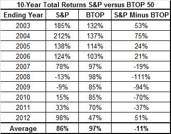
The story’s comparison of managed futures to the equity and fixed income markets was equally deceptive. Comparing the S&P to managed futures for the decade ending 2012 is a very convenient time period if one is trying to demonstrate the underperformance of the latter. This date range conveniently eliminates the 2000-2002 bear market in equities. If, instead, the article had been written three years ago reflecting a decade ending in 2009, an even more extreme opposite conclusion could have been implied with BTOP50 up a cumulative 85% with the S&Ps down 9%.

But, any analysis so dependent upon a start date, including the one just presented favoring managed futures, is meaningless and misleading. A better comparison would match the cumulative performance of the S&Ps vs. the BTOP50 over the last ten 10-year time frames. Using this approach, the commodity fund managers have ranged from underperforming equities by 75% to outperforming equities by 111%, depending on the starting year for the 10-year period. The average of the last ten 10-year periods is a toss-up, with the BTOP50 at 97% and the S&Ps at 86%.

10 Yr total returns S&Ps vs BTOP 50

Managed futures have proven to be a sound alternative investment uncorrelated to equity returns. The Bloomberg story completely discounts the many benefits managed futures have brought and will bring to the overall investment portfolio of sophisticated investors. Managed futures are not for everyone. But a good starting point for examining managed futures would be an honest representation of facts.

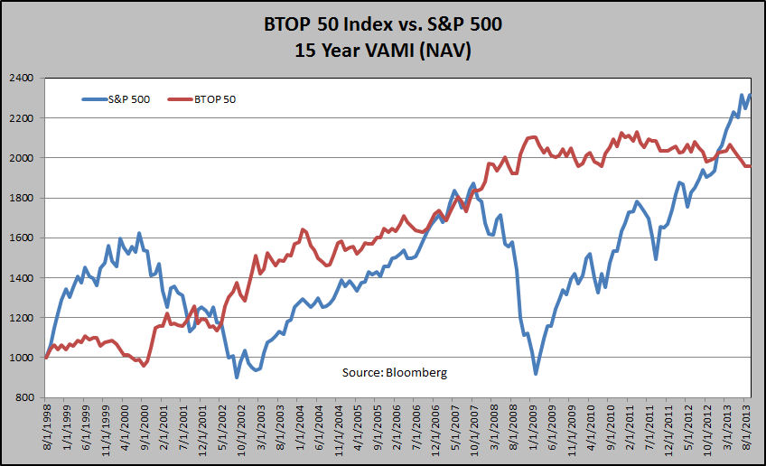
The graph below shows the NAV of a $1,000 investment in the BTOP50 vs. the S&Ps (with dividends during the past 15 years. Only with the historic rally in equities over the past few years is the S&P in a leading position. But note the volatility of growth curve of each asset class.

BTOP50 vs. S&Ps 15 Yr NAV

I am writing this response to Bloomberg’s Blooper because I am a defender of futures trading. I am also a believer in managed futures, and have placed a significant amount of my own personal capital with other traders to compliment my own proprietary trading operations.

There is no doubt that the managed futures asset class has struggled in recent years. In fact, the rolling 24-month ROR of the BTOP50 is approach a record low level and has been below zero for 13 straight months. Yet, it is not unusual for managed futures to negatively correlate with the equity markets.  Managed futures performance was outstanding during the 2007/2008 collapse of the U.S. stock market.

Good and bad performance cycles come and go in all asset classes.  But during it all, it would be wonderful to expect honest reporting by the financial press. Bloomberg Markets Magazine has failed in this regard. In the process, Bloomberg has not done itself, the financial industry or the concept of integrity any favor.


Peter Brandt

www.PeterLBrandt.com

###