A bear market bottom in Silver - Peter Brandt

Is the tarnish on Silver about to be removed?


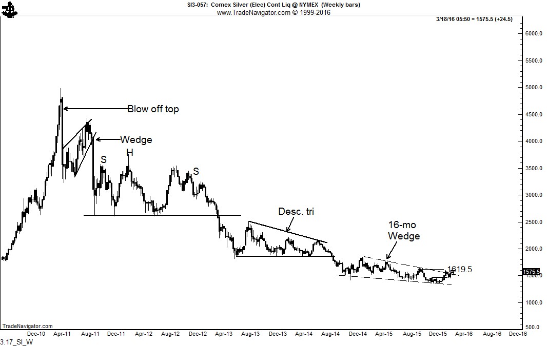
Five-year bear trend in Silver may be coming to an end

For the past five years Factor has remained negative on the Silver charts, calling for the bottom in Dec 2014. The weekly graph has now formed a 16-month falling wedge. This pattern can serve as a primary bottom based on classical charting principles.

April 2011, Factor correctly called the top in here (How do you spell bubble — SILVER) and here (8 years of Silver Supply changes hands at top).


A bear market bottom in Silver - Peter Brandt

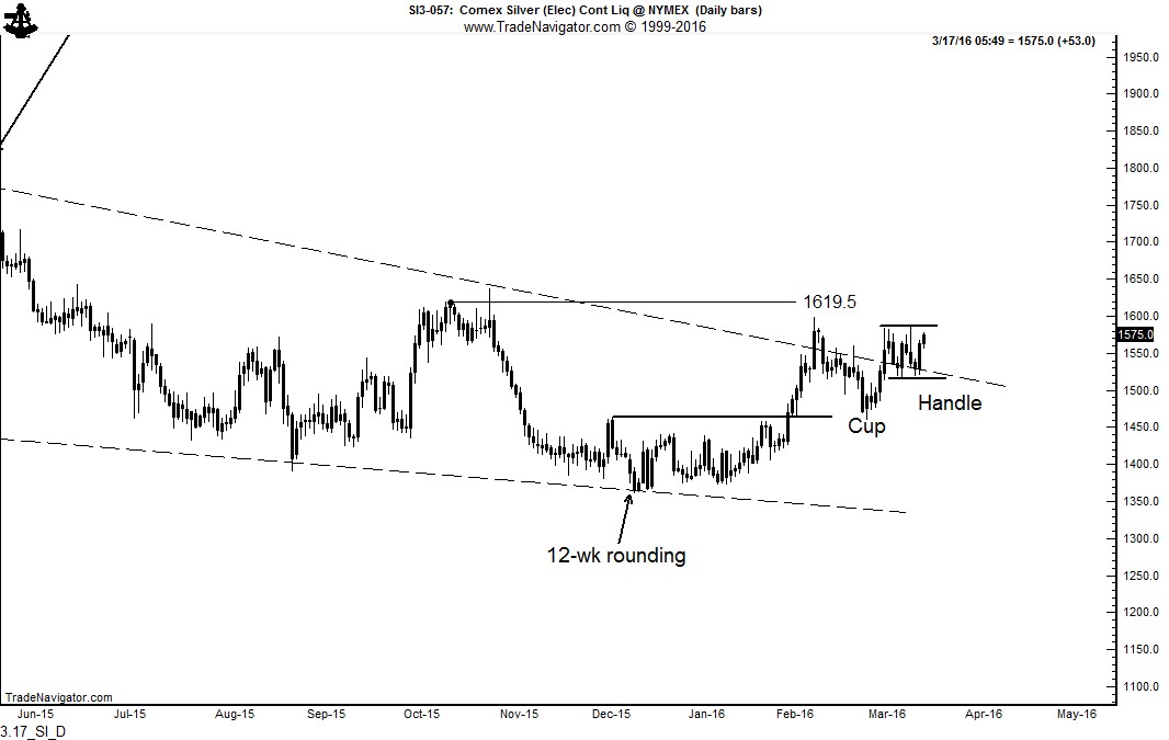
The daily chart exhibits several features. First, note the 12-week rounding bottom at the low boundary of the weekly chart wedge. The chart is now forming a possible 6-week cup and handle pattern (in form only). Note that the handle portion has formed an independent rectangle. The completion of this cup and handle pattern would also clearly resolve the weekly chart falling wedge.  The completion of the wedge would establish an initial price target of 1840.

A bear market bottom in Silver - Peter Brandt


WARNING — Silver is notorious as a volatile market that whips traders around without warning. A $1 swing can occur at any moment. I far prefer to trade Gold.


$SI_F, $SLV


Is the present decline in the S&Ps a déjà vu of 2011?


Examining the chart structures of 2011/2012 with the present period

Classical charting principles at the core represent analog analyses -- that certain price patterns tend to repeat over time with slightly different variations.

An interesting analog situation has developed in the S&Ps. Some technical analysts have declared that the current market construction is analogous to 2011/2012 and will be similarly resolved by a continuation of the dominant bull trend. I completely disagree. Let’s examine the construction components of each period. The top chart is the S&Ps during the 2011/2112 period. The bottom chart is the current market.
  • Both periods had a textbook H&S top and, coincidentally, each top was completed in the month of August -- both marked as Stage 1
  • Both periods quickly met the target of their respective H&S top patterns only to develop a period of extreme volatility -- both marked as Stage 2
  • Both periods then rallied sharply back into the price zone of the initial H&S top pattern only to develop an other range of volatility -- both marked as Stage 3
2.23_ES_2011.2012 2.23_ES_2015.2016 Read More

Short England Long Sweden — that is what the forex markets are saying


British Pound/Swedish Krona price charts displays extremely bearish construction

The weekly chart of $GBP/SEK completed an 11-month H&S top in mid January. This pattern has a price target of 11.18 SEK to 1 GBP. 2.23_GBP.SEK_W Read More

The chart case for a bear market in U.S. equities


All major U.S. stock indexes are forming potential tops

A case can be made based on classical charting principles that the current decline in the U.S. equity markets is just phase one of a larger price decline -- in other words, that U.S. stocks are in a bear market. Consider the following. Factor believes that the most significant price of the day is the closing price and the most signficant price of the week is Friday's closing price. The weekly closing price chart of the DJIA displays a possible H&S top pattern. This top has not yet been completed, but a Friday close below 15,800 would do so. 2.14_DJI_Wc Read More

Has a new bull market in Gold begun?


Gold is the purest charting market of all. The Gold market always rings a bell at major turning points. Gold has been in a bear trend since the 2011. Well, guess what ...

Bell   Read More

Japanese Yen is attempting to break out of a major H&S pattern.

A chart analysis of the forex markets

This post looks at the present forex markets through the lens of classical charting principles, as originally forumated in the early 1930s by Richard W. Schabacker, editor at the time of Fortune Magazine. Factor LLC is recognized as one of the world’s preeminent authorities on classical charting principles as applied to the futures and forex markets.

There are a number of forex crosses that indicate substantial trading opportunities for traders willing to hold positions for weeks or even months. Before examining the current forex markets, a basic understanding of classical charting principles is approriate.
  • Charts simply show where a market has been, what it is doing now, and what the path of least resistance might be. Classical charting is simply an attempt to define market behavior in geometric terms. The real edge provided by classical charting comes from the marriage of risk management with well-defined geometric patterns.
  • There is no magic in price charting. Charts do NOT predict the future. Unlike some Elliott Wave adherents who attempt to label every zig and zag, I believe that the vast overwhelming majority of markets the vast overwhelming proportion of time cannot be understood through the lenses of classical chart principles (or any other method of technical analysis, including Elliott Wave Theory).
  • Well-defined chart patterns naturally provide opposite possible outcomes. A rectangle can complete in either direction. A rising wedge can become a running wedge. A symmetrical triangle can fake a trader out in more ways than imaginable. A H&S pattern can become a H&S failure. And on and on it goes.
  • Charts are subject to morphology. I do my best to always find a geometric explanation for price action. As a chart morphs it can be subject to different geometric construction. As a general rule, intraday charts morph more often than daily charts, daily charts morph more often than weekly charts. But, more often than not a market cannot be explained easily by geometry. It is then time to find another market. This is why I might be focused on Robusta Coffee one day and some foreign stock index another day. I want to focus on markets I can define geometrically.
  • Reliable chart trading is cyclical. There are periods during the year (an average of two periods lasting two or so months each) when an unusual number of markets form well defined patterns AND the markets respond to those patterns in predictable fashion. Using language of farming, this is time to make hay. During the other periods we rely on aggressive risk management to limit our losses and keep out pile of chips somewhat intact.
  • It is a thing of beauty when classical chart configurations work. It is a thing of frustration when they do not work. It is a thing of confusion when the majority of markets defy definition from a classical charting perspective.

A review of selective forex markets

Eurocurrency (EUR/USD) The long-term trend (as featured by the 45-year trendline) in EUR is under threat, as shown by the quarterly graph. The dominant chart construction is the 6-1/2 year descending triangle completed in Jan 2015. This pattern has a target of $.84. Such a decline would likely be accompanied by a massive change in the European Currency Mechanism (ERM). 2.7_EUR_Q Read More

Bottom in Precious Metals???


There are some signs that the 4-plus year bear trend in the precious metal markets is coming to an end

As I have pointed out always constantly, I hate trading Silver. Silver can move $1 one way or the other and mean nothing technically. Gold is a technically honest market, and usually the leader. All things being equal, I would much prefer to trade Gold rather than Silver. 2.3_GC_D Read More

The U.S. stock indexes are NOT making H&S tops!!!

Xmas tree H&S  

Note: The post herein was absolutely wrong on the analysis of the H&S top in stock indexes. Guess what -- traders are wrong from time to time. I make bold calls and some are right and some are wrong. At the end of the day, price is king and nothing else matters. Members of the Factor research service know that I over-rode the analysis herein on January 6, cautioning that the stock market had deep internal trouble.

Classical charting principles have rules. The Head and Shoulders is a classical chart configuration. The apparent and well-advertised H&S top in the U.S. stock indexes do not meet the rules.

Perma-bears, a H&S top is not sitting for you under the Xmas tree!

Sorry to all of you stock market doomsayers, but labeling the U.S. stock index charts as H&S tops just does not work. Volume is an important criteria upon which to judge the validity of the H&S patterns. Richard W. Schabacker (Technical Analysis and Stock Market Profits), and later, John Magee and Robert Edwards (Technical Analysis of Stock Market Trends), are considered the pioneers in classical charting principles. According to the founders of classical charting, as a rule volume should be greatest in the left shoulder or head and lightest in the right shoulder in order to validate a H&S pattern. As the charts of the Dow Jones Composite, Dow Industrials and S&P 500 show below, the largest slug of volume has been in the right shoulder. This is NOT a sign of a valid H&S pattern, thus the interpretation of a H&S top in the U.S. stock index charts is not likely to be correct. 12.23_DJIA Read More

The Chart of the Month — MSCI World Index building a top??


MSCI World Index forming a massive 2-year H&S top

The MSCI Index appears to be rolling over in a right shoulder of a significant top pattern. One must be blind not to notice the similarities between this potential top and the chart top completed in 2008. Also, notice how the right shoulder held at the 6+ year trendline. The completion of the H&S top would also violate the trendline. A completion of this top could lead to a decline toward 1400. MSCI   
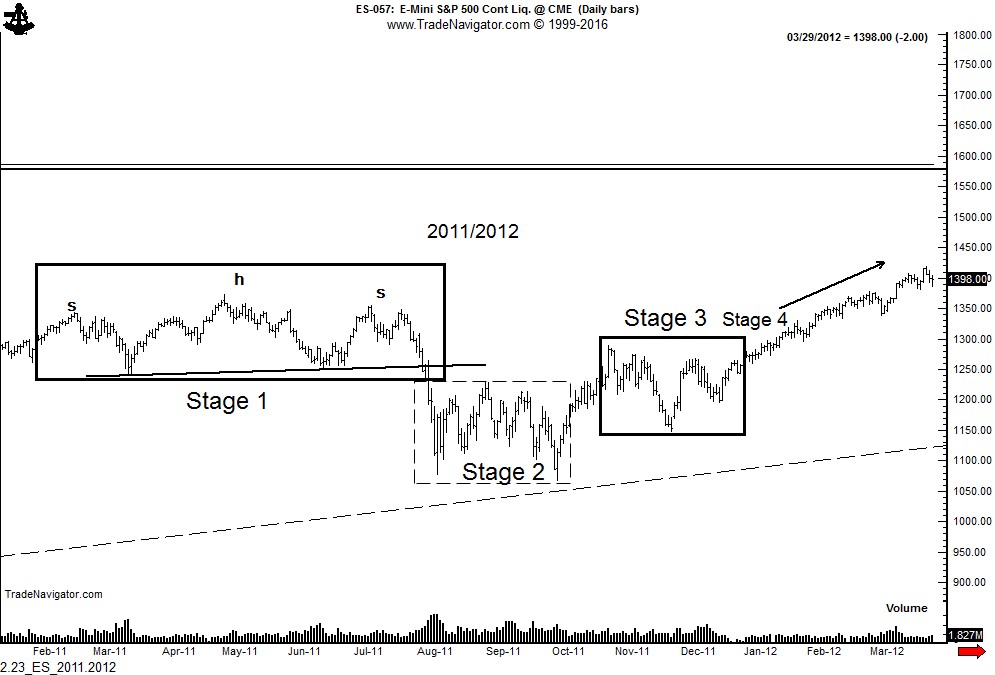
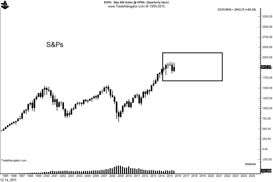
But I am NOT a doomsayer. In U.S. stocks I am NOT a bear and I am NOT a bull. In fact, I believe the S&Ps will remain in a range of 10% above the recent high to 10% below the recent low for the next five to eight years.
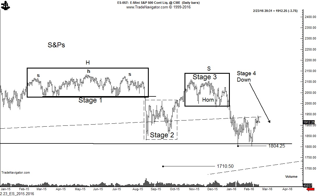
 12.14_SPX Read More

A chart analysis of the Swiss Franc


Charts indicate that the USD/CHF could trade at 1.1200 and perhaps as high as 1.2350.

Swiss National Bank is intent upon driving the Franc lower (i.e., USD/CHF higher)

 
Note: This report represents the type of analysis routinely provided to members of the Factor Service. Members of the Factor Service have been advised for three weeks to be long USD/CHF. For information on the Factor Service, click "Subscription" on the upper menu bar. The membership rate for new members to the Factor Service will be increased by $100 per year beginning January 1.
When analyzing the charts of a commodity, stock or foreign exchange pair, it is always best to start with a long-term view and work towards the shorter-term. The 100-year chart of USD/CHF shows that the USD is extremely cheap in historical relationship with the CHF, as shown below. Market observers who believe the USD/CHF cross is overheated do not have a clue. The clueless bunch were screaming "overbought" on USD/JPY back in Jan 2013 when the cross was under 90 to 1, on its way to 123 to 1. USD.CHF 100 years Read More