Silver bulls, don’t worry, just draw a lower trendline
This content is for members only

What do the two have in common?
An opinion is NOT a position. A position is NOT an opinion. In the final analysis, the two have nothing in common. Yet, be aware that in this blog I sometimes present opinions and market perspectives (and misc. things I find interesting at the moment) and other times venture into the world of positions.
I have supported myself and my family by trading commodity futures and forex since 1980. Along the way I have made every mistake possible – many more than once. I have had really great years, and I have had losing years. I have had spectacular trades, and I have regularly had drawdowns (in fact, I am in a drawdown right now, so ignore any specific trading idea I might present).
Over the years I have formed principles that guide my trading. One of those principles is that an opinion is not a trade. I may have an opinion – even a strong one – about a particular market, but that does not mean I will have a position. Similarly, whenever I have a position I try not to form an opinion, because opinions lead to biases, and biases can lead to bad trading decisions. Frankly, I think that market opinions are dangerous when they are mixed with trading strategy. All too often I mix this fatal brew.
So, if market opinions do not guide my trading, what does? The charts…and specifically, classical chart patterns that are usually eight or more weeks in duration (preferably 14 weeks or longer) and offer specific risk control set-ups for entry. Because I always risk much less than my profit target, my ratio of losers to winners is quite high and always has been. Historically I am unprofitable on 65% of trading events, although over short periods of time that figure can range from 50% to 80%. Personally, I think the idea of chasing trading approaches that are right 80% of the time is a joke. I believe that the payoff in trading comes from risk control protocols, not from trade selection.
I have made my net-bottom line profit from fewer than 10 percent of my trades. The other 90 percent of trades have been wash-outs. Wouldn’t it be wonderful if I knew in advance which 10 percent of the trades would deliver the goods? Although even if I did know this in advance, my human emotions would probably push me into some of the other trades.
Some of my blogs have expressed opinions or perspectives on markets in which I have not had a position. I have no position in Silver nor is there any chance I will have a position within the next two or three months. I am long Gold and have been since April 5. The market came within an eyelash of my target on Monday, so I will now jam my stop.
A lot of my blog posts (perhaps the majority) reflect opinions or market commentaries or market perspectives that are disconnected from my trading operations. If you only heard from me when I took a position, you would not hear from me very often (perhaps you would rather have it this way). Similarly, I post a number of charts on Chart.ly that I find interesting, but do not even come close to qualifying for an actual trade.
But, periodically I will tout a trade I am entering – and again, a position is not an opinion and an opinion is not a position. A position, purely and simply, is a specific market set-up that provides certain risk/reward characteristics.
I have touted several of my actual, real-time trades in this blog. I laid out the specifics of a shorting strategy in Apple Computer – that trade did not work, but it provided the type of a risk/reward profile I dream about. I only get about ten or so set-ups per year like I had in AAPL.
On April 21, I posted a long strategy in the S&Ps and Nasdaq. I went long the Nasdaq on April 20 and the S&Ps on April 25. The jury is still out on these trades. Currently my stop in the Nasdaq locks in a small profit and my risk in the S&Ps is about 40 basis points.
On March 25 and April 1, I laid out a technical case for a bull move in the emerging stocks markets. I did not play this one in futures, but moved 50 percent of my IRA funds into emerging markets and China between March 23 and March 30. I pointed out this situation before I finalized my trade. The jury is still out on this trade as well.
On April 13, I made the case for being long Soybeans and short Corn. I am in this trade. This is a trade that may require two or three years to fully play itself out, but it is a single trade than could return 20 to 30 percent to a portfolio. I completely understand that in the age of day trading, a trade that requires two or more years to work is not something most of you care much about. But, nevertheless, it is a trade I am carrying and will likely be carrying for a considerable period of time. BORING!
Over the years my trading horizon has gotten longer while the horizon for most traders has gotten shorter. Apparently I am out of step with the world.
So, once again, in my mind, positions are not opinions and opinions are not positions. Yet, in this blog I deal cards out of both decks. Hopefully as readers you will become aware of the deck from which I am dealing in any given blog posting, and will react to the post accordingly. If my opinion runs counter to your opinion or your position, please do not take it personally.
###

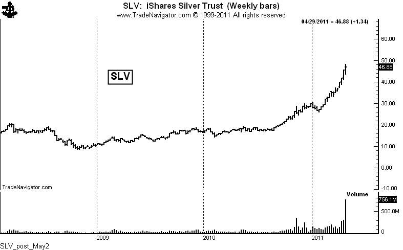
Value of Silver trading equaled 1.5 times the entire value of NYSE trading
First off, before I say anything more, let me congratulate those of you who sniffed out the bull market in Silver and have made a killing. Whether your reasons for being a long holder of Silver (bullion, ETFs, producers) prove to be right or wrong, you have made a ton of money – and at the end of the day this is what counts. I missed this bull move (although I nailed Gold). I admit it. So, whatever I say about Silver has to be placed in the context of the fact that one of the biggest trends in the history of raw materials took place with me as a spectator, not as a speculator.
With this admission in place, let me get to the subject.
I do not ever recall volume (relative to supply) in any commodity or stock like we witnessed last week in Silver. The entire global supply of Silver in 2010 was approximately 1,056.8 million ounces. This includes Silver from mines, government sales, and scrap, with an adjustment for hedging activities.
Last week’s total trading volume in Silver was at least 7, 915 million ounces, counting the Comex plus SLV and other Silver ETFs. In other words, 7.5 years worth of Silver supply changed hands last week.

Historically, huge slugs of trading volume have been either “starting” volume (the kick-off a trend) or “stopping” volume (the end or beginning of the end of a trend). Exceptions to this rule are almost non-existent, although I am sure Silver bulls would say…”This time it’s different.”
 Let me put this volume of Silver trading into another perspective. To date in 2011 the average weekly value of stocks traded on the NYSE has equalled $259 billion. Last week the value of Silver traded (at an approximate average price of $46 per ounce) was $364 billion.

The unprecedented volume of last week may very well lead to further sharp price advances. But the odds overwhelming favor the fact that a volume in one week equal to 7.5 times annual global production is the start of an enormous distribution phase. Silver ownership is being moved from strong hands to weak hands.
At best, Silver is likely to undergo an extensive and very broad trading range. The shine is off the coin.
###
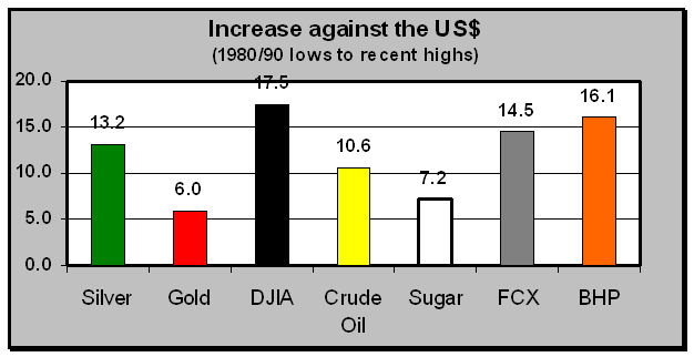
If you are bearish on the US$, there are better bets to make.
In recent days many a Silver bull has attempted to convince me that Silver is a play against the US$. I don’t buy it for a minute. Silver is a raw material commodity. End of story. That Silver is considered a semi-precious metal is irrelevant.
In fact, I will maintain that there are far better ways to make a bet against the US$ than by owning Silver. A picture is worth a thousand words. So I will let the graph below do most of the talking for me.

From the price lows of the 1980s/1990s, Silver has increased 13.2 fold against the US$. In contrast, Gold has only increased by a factor of 6.0 – in other words, Silver has been twice as good of a bet. On a pure price appreciation basis, Sugar was a better hedge against the US$ than was Gold. Perhaps we should all be carrying Sugar cubes to protect us against the incompetence of the Geithner/Bernanke cabal.
So what has been the best bet in US$-denominated terms – stocks – all stocks. In fact, the DJIA has outperformed shares in the largest precious metal producers, BHP Billiton and Freeport-McMoran (both of which have outperformed Silver). In fact, the DJIA has outperformed Silver by 33 percent, even after one of the worst performing decades for stocks in history. This does not even factor in dividends – and the last time I checked, the only dividend Silver pays is oxidization stains in the pocket.
If you want to make a play against the US$, Silver is a second-class citizen with the last name of “Bubble.”
This bull market may carry Silver prices to $60 or $70 or — as proof of the market’s absolute insanity — even $100. But I stand by my prediction that within five years Silver prices will be in the teens.
###
Even a market blow-off has a Silver lining
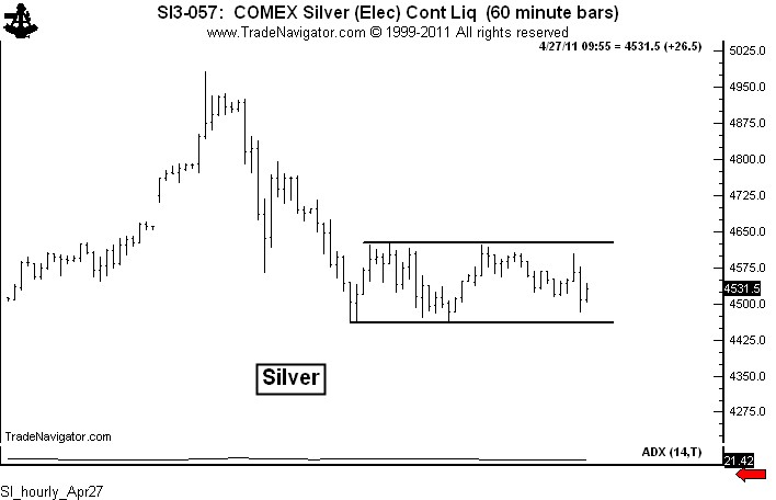
As a general rule I do not like using intraday charts. The reason is that intraday chart patterns have a failure rate of 75 percent, although I know some excellent short-term traders who use intraday charts in conjunction with various indicators to wring a profit out of the markets consistently. But as for me, intraday charts are normally not in tool box. Normally, that is!
There are rare market conditions during which intraday charts can be extremely useful for scalping and timing. The predominant condition is when a market is in a sharp advance or decline. In such market conditions, intraday charts can be useful for identifying the end of a countertrend correction or brief consolidation. Hourly charts are utterly useless, in my opinion, in broad sideways markets such as we currently have in Copper, Soybeans, USDJPY, to name a few. But for running markets, intraday charts can be a great tool.
Thus was the case this week in Silver. I absolutely believe that Silver is in the blow-off stage of a massive bubble. I have heard all your arguments for why Silver is fairly or even cheaply priced at these levels – Fed policy, weak dollar, etc., etc. Frankly, I don’t buy these reasons. This time it ISN’T different. I heard similar arguments from perpetual Silver bulls for 25 years after the last Silver bubble burst in 1980. According to the Silver bulls then, they were right and the market was wrong. They point to the current bull market as their redemption. Some redemption! Anyone who bought Silver at the absolute low in 1982 has earned a compounded 8.1 percent annually at current price levels. But even this “spectacular” rate-of-return has to be downwardly adjusted for the cost of carry.
Anyway, back to the hourly chart theme.
Sunday evening I posted a blog stating my opinion that Silver was in a bubble. To traders, having an opinion is different than having a position. Opinions are NOT positions. Early on Wednesday, using Chart.ly, I began posting hourly charts suggesting that Silver was preparing for another (and final?) upleg in the blow off. The intraday charts were clearly showing that a corrective phase in Silver was coming to an end. Following are these Chart.ly posts.
“Think SI is in blow-off, but one more big leg poss. Watch rect on hrly chart for timing.” Apr27 6:32AM.

“Resolution of hrly chart will either lead to another up leg or confirm a possible top.” Apr27 12:50PM
The, finally…”Hrly rectangle completed. Should usher in new up leg.” Apr27 1:59PM

So the lesson is this – in sideways and choppy markets, except for the swift of foot, intraday charts are not very useful; but, in running markets intraday classical chart patterns can be used for low risk scalping. By the way, the target of 47.84 from the rectangle bottom on the hourly chart has almost been reached as of this writing. And notice that a new rectangle is appearing on the hourly chart.

By the way, there is another lesson in this story. Taking positions against one’s bias is not only possible, but can often be quite profitable. To a trader, an opinion is not a position and a position is not an opinion.
It will probably be another year before I blog about hourly charts.
###
Charts don’t work like they used to!
This is the first of three blog postings on the (un)reliability of chart patterns for trading. This posting lays the claim that chart patterns are increasingly unreliable for trading. The second posting (when I get to it) will pose the possible reasons why this has occurred. The third posting will address solutions to the problem.
I’ve traded futures and forex on the sole basis of classical chart formations since 1980. I have not used volume or open interest, Commitment of Traders data, moving averages, oscillators, or any of the “latest and greatest” technical indicators. In fact, I am not a fan of indicators because they are simply derivatives of price. My attitude has been, “Why study derivatives of price when I can study and must trade price itself?” If you disagree with me and have been consistently successful, your success speaks for itself. In the business of trading, everyone must find their own niche that works.
If anybody has earned the right to speak about chart patterns, I think I should at least be on the short list. My conclusion – chart patterns are far, far, far more unreliable today than at any other time in my trading history.
There was a time (in the 1980s – many of you were not even born then) when as a chartist I would enter a trade based on a classical chart pattern and mentally and emotionally “bank” the profits. Patterns were extremely reliable. But, when patterns did not work, at least traders on the other side of the market made money! If I am long and wrong, I want traders who are short to make money. That is the way it should work. The worst possible trading environment, in my opinion, is when both long and short position traders are eating humble pie.
There is one other dimension to this. In the “good olde days,” when a chart pattern failed it told me something important about the market. Now, patterns just fail and provide no lessons. I have never been a very good “range” trader.
My guess (I wish I had kept good data back then) is that 50-plus percent of chart patterns worked in the 1980s. I define “working” as reaching the measured-move target without digging back into the completed pattern. Usually patterns worked immediately and decisively.
In recent years only 25 percent of patterns have worked. We have entered a period I call “chart morphing.” This may represent the new norm. Chart morphing occurs when one identified chart pattern breaks out, but fails, only to become a component of a larger chart pattern, that in turn breaks out, but fails, only to become a component of a larger chart pattern, etc., etc.
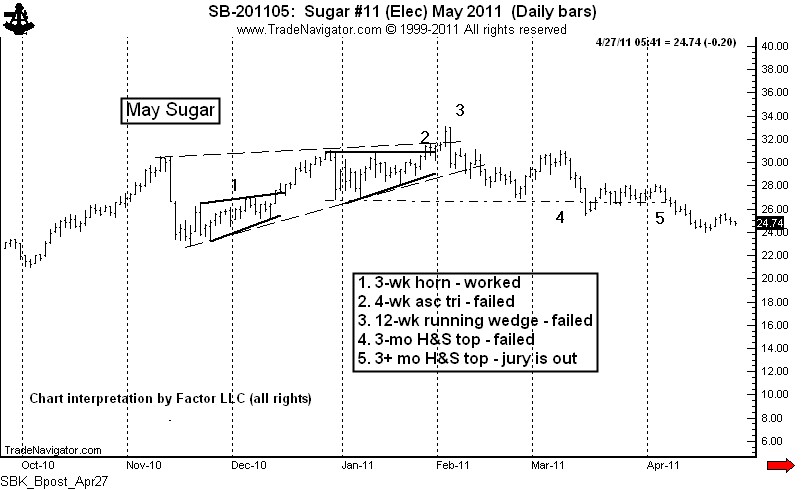
The following chart of Sugar demonstrates this chart morphing concept. In this case I identified and traded six patterns in real time. Only one delivered a profit. There was a time when three or four of six patterns, not one of six, would have delivered a trend to the implied target. We now have a six-month trading range in Sugar with no clue as to the next dominant chart pattern. As a chartist you may have labeled May Sugar in an entirely different way. That’s what makes a market.
The above reality of chart morphing is that a trader can lose 80 points in a 30-point trading range over a sequence of trades and months only to become gun shy just in time for the real breakout to occur. If you are a chart trader, is this a world you can relate to?
Does all this mean that classical charting is no longer a valid way to trade? Not at all! It does mean that the time frames, tactics and money management principles of using charts must be modified. I will have more to say about these things in future posts.
###
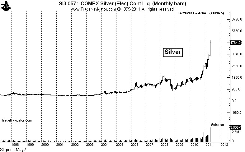
The Silver market is within months, or even weeks, or even days of a major top.
The Silver market has entered a classic blow-off top. There is no question but that Silver is a bubble in the making…and will soon be a bubble in the breaking.
The similarities between the current exponential spike in Silver and the Nasdaq in the late 1990s are striking. While Silver could surge significantly higher before the top (driven by investor mania and CFTC-sanctioned cornering /short squeeze maneuvering), perhaps even to $60 or $70 per oz., the odds are very high that Silver will be back in low teens within the next five years.
Silver currently is right in the blow-off sweet spot that drove the Nasdaq from October 1999 to the March 2000 high. Once again the individual investor will be burned badly.

Millions of investors have bought into the idea that the Silver is the best thing going – that between global supply and demand factors and a hedge against paper currency, Silver actually deserves to be priced at current levels. There are actually web sites touting $200 and even $1,000 Silver prices.
The Silver market reminds me of the mania surrounding the Nasdaq – just prior to the start of its 81% decline into 2002. Do I think Silver could experience an 80% decline? Absolutely! Of course, the shorts could go broke before Silver finally tops, so I have no desire to step in front of this run-away train.
Many of the investors in the raw material markets today are unfamiliar with the boom-to-bust-to-boom-to-bust nature of the commodity markets. So, if this is you, enjoy your profits now, because if you are a long-term bull on Silver, your definition of “long term” is likely to be redefined in the decades ahead.
I am also including a chart of the last grand bull move in Silver. A picture is worth a thousand words.

In the commodity markets, what goes up will eventually come down.
###
AKA, when I short AAPL pie, I need to prepare to eat HMBL pie

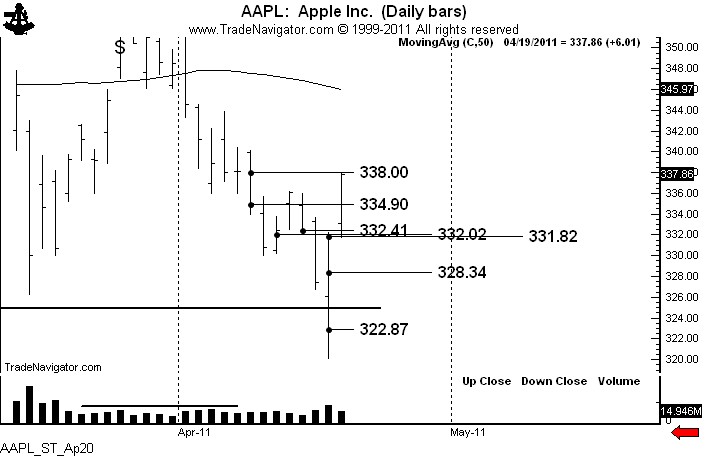
A number of readers have asked me to recap my recent trades in Apple Computer. Of course, I was a busy little beaver posting the details of my shorting campaign – mainly motivated by all the hate messages I received from my initial AAPL posting, then the post that laid out a trading strategy to risk 75 basis points (3/4 of 1%) to make 1420 basis points (14.2%).
I detailed my trading in AAPL during the course of six blog posts and 15 StockTwit posts. See the chart for the graphic representation of my trading. The sales are circled.

So, here is how my AAPL trade unfolded.
Bottom line:
Lessons:
###
Thank God I’m a trader, not an analyst!
There is a huge difference between being a trader and being a market analyst.
Analysts are paid by being right. On this basis alone I am not smart enough to be an analyst. Traders are paid by managing risk. These two skill sets are a world apart. In my experience, people who try to be traders by being analysts usually lose their grip at both ends of the rope.
An analyst will be judged negatively by poor market calls. When wrong, a trader closes the trade and moves onto the next opportunity. Hopefully, little harm done! Being wrong is a fundamental assumption for a trader.
Analysts study industries, companies and economic conditions. Traders, at least most traders, study price and could care less what company the price represents.
Analysts – even technical analysts – become heavily vested in the rightness of their opinions. Analysts gain reputational equity based on their correct calls. Traders become economically vested by what they do with their losing trades. Traders gain capital equity based on their handling of losing calls.
When an analyst changes an opinion on a stock or the general market, it is called a “revised forecast due to changing fundamentals.” When a trader changes an opinion on a trade, it is called “flexibility for capital preservation and survival.”
I am a classical chartist. I view charts as a trading tool, not a method to forecast prices. I don’t believe charts can forecast prices. I have a disdain for “chart book economists.” I do believe that charts can provide unique high potential/low risk trading opportunities. To me, that is the only real value of charts. The idea of forming some grand economic scenario based on a chart is absolutely ludicrous.
The reality is that most chart formations fail to deliver the goods, especially chart patterns of shorter durations. This is why so many novice traders give up on charting, claiming that charts don’t work.
Chart patterns fail and morph into new and larger chart patterns, which morph again and again and again. I term this process “chart redefinition.” All massive chart patterns of six to 12 months in duration are made up of dozens of short-term daily patterns and hundreds of intra-day patterns that mostly failed.
Eventually a chart pattern will mature and provide a grand speculative opportunity. It is this type of opportunity that I seek. But along the way I am wrong on 65% of my trades. During some shorter-term periods of time that figure can be as high as 80%.
This is why I look for particular chart set-ups that offer a reward to risk relationship of 10 to 1, or 20 to 1, or even as high as a stage in a recent trade I made in Apple Computer, 70 to 1. I am not sure what the price of AAPL will do in the days and weeks ahead, but if refuse to take a trade with this type of reward to risk relationship I need to be put out to pasture.
One of the mental hurdles a novice trader must get past is the connection between being right on a market and making money in a trading operation. The two are disconnected. It is hard to explain this concept to a non-combatant, but all front-line soldiers reading this blog posting know exactly what I am talking about.
Trading is not for you if you have some pride of ownership in forecasting prices. If this is you, find a diet not consisting of buy and sell orders. Heck, perhaps you can find a job as an analyst.
###
![]()


