
Using hourly charts to trade silver
Even a market blow-off has a Silver lining
As a general rule I do not like using intraday charts. The reason is that intraday chart patterns have a failure rate of 75 percent, although I know some excellent short-term traders who use intraday charts in conjunction with various indicators to wring a profit out of the markets consistently. But as for me, intraday charts are normally not in tool box. Normally, that is!
There are rare market conditions during which intraday charts can be extremely useful for scalping and timing. The predominant condition is when a market is in a sharp advance or decline. In such market conditions, intraday charts can be useful for identifying the end of a countertrend correction or brief consolidation. Hourly charts are utterly useless, in my opinion, in broad sideways markets such as we currently have in Copper, Soybeans, USDJPY, to name a few. But for running markets, intraday charts can be a great tool.
Thus was the case this week in Silver. I absolutely believe that Silver is in the blow-off stage of a massive bubble. I have heard all your arguments for why Silver is fairly or even cheaply priced at these levels – Fed policy, weak dollar, etc., etc. Frankly, I don’t buy these reasons. This time it ISN’T different. I heard similar arguments from perpetual Silver bulls for 25 years after the last Silver bubble burst in 1980. According to the Silver bulls then, they were right and the market was wrong. They point to the current bull market as their redemption. Some redemption! Anyone who bought Silver at the absolute low in 1982 has earned a compounded 8.1 percent annually at current price levels. But even this “spectacular” rate-of-return has to be downwardly adjusted for the cost of carry.
Anyway, back to the hourly chart theme.
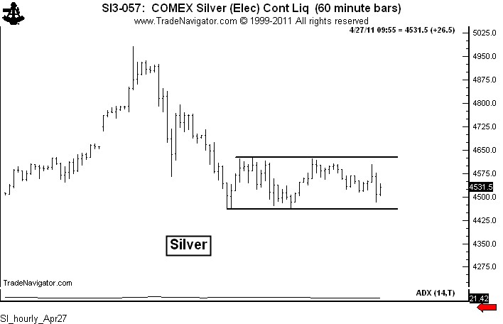
Sunday evening I posted a blog stating my opinion that Silver was in a bubble. To traders, having an opinion is different than having a position. Opinions are NOT positions. Early on Wednesday, using Chart.ly, I began posting hourly charts suggesting that Silver was preparing for another (and final?) upleg in the blow off. The intraday charts were clearly showing that a corrective phase in Silver was coming to an end. Following are these Chart.ly posts.
“Think SI is in blow-off, but one more big leg poss. Watch rect on hrly chart for timing.” Apr27 6:32AM.

“Resolution of hrly chart will either lead to another up leg or confirm a possible top.” Apr27 12:50PM

The, finally…”Hrly rectangle completed. Should usher in new up leg.” Apr27 1:59PM

So the lesson is this – in sideways and choppy markets, except for the swift of foot, intraday charts are not very useful; but, in running markets intraday classical chart patterns can be used for low risk scalping. By the way, the target of 47.84 from the rectangle bottom on the hourly chart has almost been reached as of this writing. And notice that a new rectangle is appearing on the hourly chart.

By the way, there is another lesson in this story. Taking positions against one’s bias is not only possible, but can often be quite profitable. To a trader, an opinion is not a position and a position is not an opinion.
It will probably be another year before I blog about hourly charts.
###

Leave a Reply
Want to join the discussion?Feel free to contribute!