Oh, what a difference a chart makes!
Using slightly different charts of the same market produces different results.
Those of you who look at my charts on the blog or on Chart.ly might have noticed that I make wide use of nearby continuation charts in the futures markets. These are charts that plot only the nearest delivery contract. When one contract expires, the next contract month is then plotted on the same graph.
Even with the category of “nearby contract” charts there are differences. One approach is to plot the nearby contract until its expiration. Another approach is to follow the contract until first notice date. Yet a third approach is to drop the nearby contract when its volume shrinks below the next closest contract month. I use the third type most often.
Frequently the nearby continuation graph will give a different picture of a market than will the chart of a specific contract month. Take the current situation in Chicago Wheat.
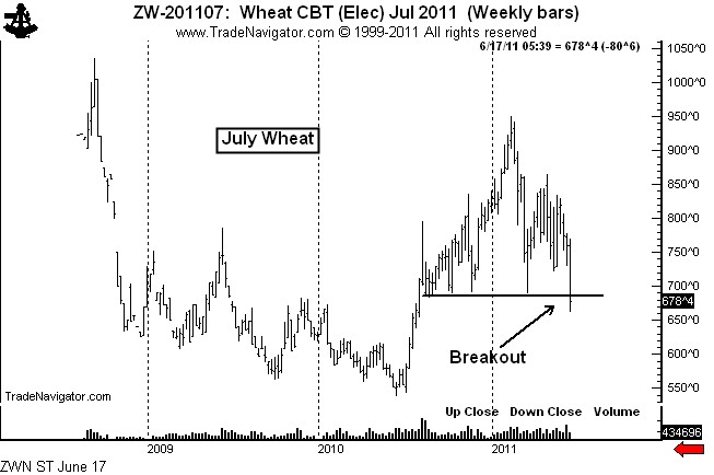
Shown below is the graph of the July Wheat contract. This chart shows that the 10+ month H&S top was completed on June 16.
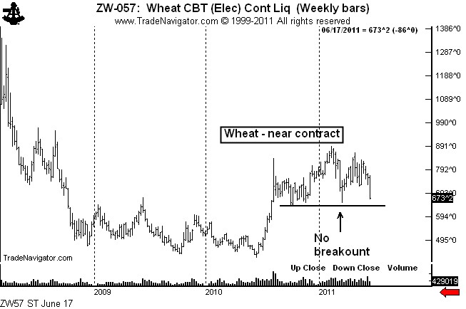
Yet, the H&S top on the nearby continuation chart has not yet been completed, as seen below.
I follow both types of charts — charts of the specific contract months and nearby continuation charts. It is by far my preference for the nearby chart to breakout first. I am always suspect of a market when a breakout by a specific contract month is not confirmed by the nearby chart. Many of my most profitable trades over the years have come from markets in which the nearby chart led the way.
###


Leave a Reply
Want to join the discussion?Feel free to contribute!