Tag Archive for: GC_F

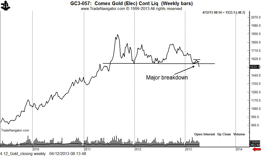
Gold — get ready to rumble (oh, I meant tumble)


The market is experiencing a MAJOR chart breakdown.

I try to pay little attention to what markets do intraday. The closing price each day is really all that matters. The most important price of the week is the Friday close. Why? All the HFT systems are flat — all the day traders have gone home. The Friday close is the price determined by traders willing to hold a position over a weekend.

Should Gold close at or near current levels ($1532), it will be the lowest Friday close in 21 months. A massive top may be completed today. Gold bulls, take this seriously … very seriously.

4.12_Gold_closing weekly


$GC_F, $GLD

Gold – Chart of the Day, April 3, 2013


Gold is hanging on the edge of the cliff

Before I mention anything about the Gold charts, let me first address the idiots among you . You are the people who will remind me in a month or so if the analysis herein is incorrect. In fact, you will remind me … and remind me … and remind me.

I am a chartist. I do not believe that charts are predictive. Charts are a tool, that’s it. I lose money on more than 55% of my trades. That means that my default assumption on each trade is that I will lose money. So, if I am wrong on this post, big deal.

Charts offer me the opportunity to identify several things about a candidate trade:

  1. Path of least resistance for a market
  2. A logical place for entering a trade
  3. The price level where I will throw in the towel if I am wrong (I normally limit the risk on any given trade to 1% of my trading capital)
  4. A possible price target or objective

More importantly — and you will not understand this point if you are a professional wannabe — certain price behavior and its resulting chart structure can provide insight into trade with extremely torqued reward to risk profiles. And this — in my opinion — is the real value of charting. So if I am wrong on a call — go whine to your psychologist! Maybe he (or she) will care.

One final point. While I give Silver bulls a hard time (they deserve it), I really do not care whether Silver and Gold go up or down. It does not matter to me. I just want to be on the right side of the move when it comes.

OK, onto the Gold charts. For a starter, please see the following post, The History of Gold Charts.

The monthly graph clearly shows the power of the bull market in Gold since 2002. This has been one grand advance.

4.2_GC57_monthly

I believe that the sideways action in Gold since the September 2011 high will be resolved by a massive advance or decline. I can read this 18-month congestion in one of two ways.

Option A is that the weekly Gold chart is forming a rectangle top pattern — and that a daily close below 1510 or weekly close below 1550 will trigger a substantial decline.

4.2_GC57_weekly Option A

Option B is that the weekly Gold chart is forming a continuation rectangle — and that a close above 1800 will trigger a substantial advance.

4.2_GC57_weekly Option B

I know that my “either or” scenarios drive you Silver bulls crazy. So, go whine to your psychologist!

The daily chart is where it gets interesting. Often times a move out of a massive pattern gets launched from a small pattern. The daily chart appears to be forming a 6-week symmetrical triangle. While not substantial, in and of itself, this triangle could be the fuse that lights the bigger pattern.

4.2_GC57

Stay tuned, boys and girls.

Disclaimer: I am short June Gold with a stop at 1602.1. I will pyramid this trade per the general thoughts presented herein.

$GLD, $GC_F


I think I know what the Gold market is doing


Gold may be showing its hand — and the hand could be a real winner for the bulls

On November 20 I posted a chart history of the Gold market. Click here to see this special 43-page report.

Two points I made in the report were:

  1. Gold is purest technical market in the world
  2. Significant trends in Gold are nearly always announced in advance based on the chart structure -Gold nearly always shows its hand in advance for those who are watchful and unbiased

Well, Gold may be showing its hand.

The monthly closing price chart below speaks for itself. Gold has been in a powerful bull trend since the 2001 low and no clear top has been formed. Absent a clear chart top, the default assumption must be that the period since the August 2011 high will serve as a continuation pattern. However, a decisive close below the 2012 low would be an indication of a top in Gold.

 1.9_GC57_monthly_close

The weekly chart shows that Gold has formed a very clear 15-month rectangle pattern. This pattern is the key to the long-term trend in Gold — whether the up trend will remain dominant or a new downtrend would emerge. In the meanwhile, Gold must be considered as trendless on a weekly basis.

 1.9_GC57_weekly

Here is where it gets interesting. Often times in the late stages of a prolonged weekly chart congestion a daily formation will develop to serve as the launching pad for the completion of the weekly chart configuration.

The daily chart in Gold displays a possible 3-month channel. A breakout of this channel could provide the springboard for the completion of the weekly rectangle.

 1.9_GC57_daily

Readers should keep in mind that I deal with possibilities, not probabilities. Most chart patterns fail, leading to a continued morphing of a congestion area. This current daily chart channel would fail to materialize and Gold could drift sideways for many, many more months. However, the possibility exists that this channel would the the last act of this sideways congestion prior to a major price advance.

Markets: $GC_F, $GLD, $IAU


###

The History of Gold Charts


Gold — the ultimate charting market


If you are unable to view the embedded pdf, click link here.

[scribd id=113820362 key=key-1iuxk1b8pcno02tgkynu mode=scroll]


$GC_F, $GLD, $IAU


Gold is in a new bull market — see important charts


Gold (priced in Swiss Francs) has begun the next leg of its bull trend

As many of you know I use the Gold/Swiss Franc ratio as a leading indicator of the price of Gold. This indicator can be used to trade Gold against the U.S. Dollar or directly against the Swiss Franc in a USD-neutral trade.

The monthly, weekly and daily charts of the Gold/CHF ratio conclude the following:

  • The longest-term trend (monthly) remains solidly up
  • The medium-term trend (weekly) has a history of developing congestion areas prior to each new advancing thrust
  • The daily graph completed a 12-month symmetrical triangle in August. The October break in Gold simply retested the upper boundary of this triangle. This retest appears to be over — and the next advancing trend in Gold has likely begun. Only a close below the November low on the daily chart would cause me to rethink this interpretation.

The Gold/CHF ratio has a target of CHF 1,800.


Markets: $GC_F, $USDCHF, $6GS_F, $GLD


###

Gold (priced in Swiss Francs) is challenging all-time record high price


The Gold/Swiss Franc ratio has been the leading indicator of Gold for years

I pay a lot of attention to Gold priced in Swiss Francs (Gold/Swiss ratio). It has been a leading indicator for years.

The advance this past week has put the Gold/CHF ratio near all-time highs. A decisive close above CHF 1643.7 would be an all-time high and would indicate further strength, possibly an advance to CHF 1835/oz. The charts below show the Gold/CHF ratio on a monthly, weekly and daily basis.

Markets: $GC_F, $GLD, $USDCHF

###


.

Charts of the day:Platinum and Silver have breakouts, Gold fails to follow (yet)


Silver and Platinum diverge from Gold. Time will tell is these buy signals are any good.

Yesterday the daily Silver chart completed a 7-week 5-point symmetrical bottom. The target is not huge — only 29.20 (we are almost there).


The Platinum chart (due largely to disruptions and a major mine) completed a similar triangle last Thursday and a possible falling wedge on Friday, although the wede interpretation is not decisive. The target in Platinim (if the wedge is correct) is 1560.

Gold is actually the metal in which I have the greatest trading interest. The Gold daily chart is lagging and has not yet confirmed the breakout in the other precious metals. The daily chart exhibits a possible 3-month triangle. An attempt to decisively clear the upper boundary of the triangle in late July and mid August and now again during the past three days have stalled (so far).

A close above 1631.7 would confirm the triangle bottom and complete the small ascending triangle that has taken shape since July 31. A bull signal would establish a minimum target of 1685 to 1710.

Final note: My own personal opinion is that all of these bullish signals will faily. Yet, market action must be respected and until there are signs of failures the correct momentum play is to buy dips.

Markets: $GLD, $SLV, $GC_F, $SI_F, $PL_F

Should the inevitable chart breakout in precious metals be trusted?


The metals are coiling ever so tightly. But, can a breakout of these coils be trusted?

All the precious metals — Gold, Platinum and Silver — continue in their well advertised coiling action.

There is a general rule in charting that the further into a coil a market travels, the more suspicious traders should be of the initial breakout. Gold is presently 13 weeks into its coil (see daily chart). A vibrant breakout is long past due. Some analysts/traders claim that Gold has already broken out. I am not among this group. The diagonal boundary of a triangle means nothing to me. Only a decisive close above the early and late July highs would represent a breakout in my book.

But even such a breakout might not be trusted. An upside breakout followed by the market’s failure to sustain strength would be a giant bull-trap sell signal. I draw your attention to the weekly Gold chart with is potentially negative by way of the violated trendline from the 2008 low and the possible descending triangle.

Nevertheless, I would go long if an upside breakout is confirmed. I would also go short if an upside breakout fails or if a downside breakout is confirmed.

Platinum is the most negative of the precious metal charts for two reasons. First, the monthly graph shows that the market topped way back in 2008, with a secondary top in 2011.

Second, the daily chart displays a more orthodox series of lower highs and lower lows. The market is forming a 10-week running wedge, a very negative pattern if it is completed.

Next, the weekly and daily charts of Silver are shown. The daily chart is very awkward — I would not trust an upside breakout.

Finally the daily chart of Gold priced in Swiss Francs is shown. This 9-month triangle needs to confirm a breakout in the individual precious metals. A close in GC/CHF above 1630 is required to complete this pattern and establish a target of CHF1830/oz.

 Markets: $GC_F, $GLD, $PL_F, $SLV, $SI_F

###


.

Why I think Platinum prices can drop, possibly sharply — and other random ramblings


Platinum charts are “on the edge of the cliff” for a $130 per oz. drop and possibly a $250 drubbing

Before I jump into my analysis I want to ramble about two points.

First, as many of you have noted I do not blog much anymore. This is exactly what I stated months ago that I would do. Not blogging is easier for me — it also gets rid of the riff raff from my blog site. If I blog frequently I get as many as eight times more visitors to any given blog post. Most of these additional visitors are curiosity seekers or tourists looking for a magic pill. The numeric relationship between regular readers and pedestrian traffic is consistent with the known fact that 9 out of 10 traders leave poorer for the experience as they seek for guru after guru. I stopped frequent blogging because I became tired of tossing pearls to swine (most likely not you if you are a semi-regular reader).  To those of you readers who regular check this blog so that you can remind me later of my miscues I would only say to you, “oink, oink.”

Second, as I have said so many times before, a viewpoint is not a position for me. I have viewpoints on the markets all the time — sometimes my viewpoint on a given market may change during the course of a week. Most fiddle dee dee market observers do not have the first clue about trading. They consider the changing of one’s mind to be a sign of weakness. They are, for the most part, trading wanna bees. I view changing of one’s mind as a necesary part of the gorilla war fare calling speculation.

In reality, while I have thousands of market viewpoints during the course of the year on the markets. I follow (about 40 futures and forex pairs) so I only get about five signals per month, or 60 or so trades per year. Do the math, 40 markets represent more than 12,000 markets days (counting Sunday night hours). Yet, there is a one in 200 chance that I may be taking a trade in a given market on a given trading trading day.

This discrepancy between market opinion and actual trading is due to the fact that my standards for actual trading actions are much more precise and demanding than my standards for having a market opinion. For those pedestrian traders among you, this means that my comment one way or anther on a given market may have no correlation to my trading portfolio.

On to Platinum! — finally you say.

This is a market where harmony of opinion to portfolio may occur. Platinum is set to offer me one of my 60 trading signals in 2012. It has already provided me with one signal (a short in April). Two signals in the same year — wow, this is more excitement than I can handle as a medicare patient.

Here is what I see in Platinum.

The quarterly graph shows that Platinum is in a broad trading range defined by the 2008 high and low. This trading range could contain the market for years to come — meaning that on yearly basis there is NO trend in Platinum. Note the massive symmetrical bottom completed in late 2003. Yet, there are still market fools who claim that long-term charts represent random price behavior. I don’t get it.

The weekly graph shows that Platinum has been the far weakest precious metal in recent years, topping in 2008 compared to an 2011 top in Silver and a September 2011 top in Gold. It is always my preference to be short the weakest member of a market category, when short the category, and long the strongest member of a category, when long the category.

The daily chart shows the importance of the 1365 to 1375 zone. I consider the December 29 close to be the important price point — the low that day was simply a “wash-out” event. Closing prices are ALWAYS more important than intra-day highs and lows.

Also, the market has formed a 10-week running wedge. I far prefer running wedges to reversal wedges because their downside completion is accompanied by a new low, not simply a boundary penetration. In this case the wedge completion would solidify a 2-1/2 year bear trend.

Thus, I will take a close below 1375 as an official sell signal. There is always a caveat — a close below 1375 followed quickly by an “end around” would totally negate my analysis.


Markets: $PL_F


###

Triangulation galore — Gold and British Pounds are set to move


The Cable ($GBPUSD) and Gold ($GC_F, $GLD) are forming classic triangle patterns on the charts

The symmetrical triangle is the least reliable of all major chart patterns. The symmetrical triangle is also the most commonly misdiagnosed pattern by novice chartists. But when a symmetrical triangle works, it is a thing of beauty.

Gold

The dominant pattern in Gold continues to be the POSSIBLE 10-month descending triangle on the weekly and monthly charts. But remember this, you novice chartists, this descending triangle does not become a descending triangle until it is completed. Until then it is only a possibility. A close below $1500 (+/- $10) is required to complete the descending triangle. This would establish a downside target of $1150 or so.

A nifty little 10-week symmetrical triangle on the daily graph is forming near the lower boundary of this descending triangle. This symmetrical triangle would be completed by a close below the June 28 low at 1547 or above the July 3 high at 1626 — however, a close above 1615 would nick the upper boundary of the triangle. Such an event would stack the odds for an eventual completion with a target of 1700 (+/- $10).

Interestingly, the chart for Gold expressed in Swiss Francs displays a textbook symmetrical triangle. A close above 1600 would complete this triangle and establish a target of 1740 CHF/oz.

British Pound ($GBPUSD, $G6B_F)

$GBPUSD presently represents the grand daddy of all symmetrical triangles. The monthly chart displays a possible 43-month triangle. The problem with this pattern is that we are working too far towards the apex. Valid triangles should breakout no more than 60% or so the distance to the apex. This pattern is pushing its limit.

The daily graph displays a possible 9-week symmetrical triangle bottom. Symmetrical triangle bottoms require five contact points, the first of which must be a low under classical charting principles. This is unlike Elliott Wave whereby a high can count as the first point for a symmetrical triangle bottom.

A close by the daily chart above 1.5730 and especially above 1.5800 would complete this triangle and set up the possibility that the multi-year triangle is ready to be launched.


Markets: $GLD, $GC_F, $USDCHF, $G6S_F, $G6B_F

###


.