AUD/CAD – Chart Developing

  AUD/CAD -  This cross flashed a significant sell signal on Friday. I view short AUD/CAD as a potentially rewarding cross in the weeks and months ahead. This is a cross that can be traded in the spot forex market or using futures contract on a one-to-one basis, although such a trade would be over-weighted to CAD.
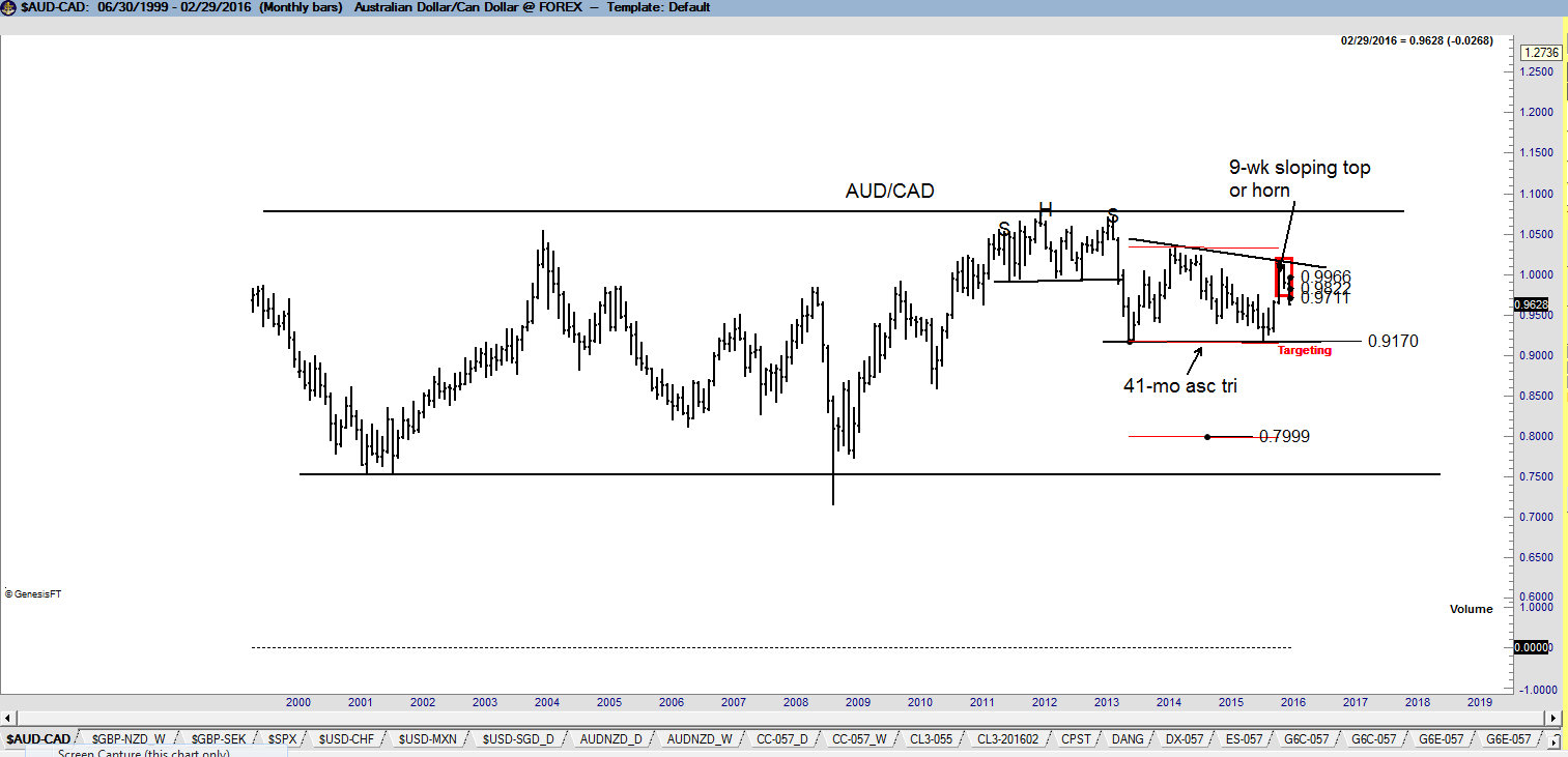
The longest-term charts show that AUD/CAD have remained in a broad trading range for many years.
 
image
 
The weekly chart displays several patterns worthy of note. The decline in June 2013 completed a 24-month H&S top pattern. The decline from this H&S has queickly turned into a 41-month descending triangle pattern. This is this pattern that most has my attention. I believe that the completion of this descending triangle would result in a decline in AUD/CAD to the low end of the historical price range at .7600.
Read More

Is the present decline in the S&Ps a déjà vu of 2011?


Examining the chart structures of 2011/2012 with the present period

Classical charting principles at the core represent analog analyses -- that certain price patterns tend to repeat over time with slightly different variations.

An interesting analog situation has developed in the S&Ps. Some technical analysts have declared that the current market construction is analogous to 2011/2012 and will be similarly resolved by a continuation of the dominant bull trend. I completely disagree. Let’s examine the construction components of each period. The top chart is the S&Ps during the 2011/2112 period. The bottom chart is the current market.
  • Both periods had a textbook H&S top and, coincidentally, each top was completed in the month of August -- both marked as Stage 1
  • Both periods quickly met the target of their respective H&S top patterns only to develop a period of extreme volatility -- both marked as Stage 2
  • Both periods then rallied sharply back into the price zone of the initial H&S top pattern only to develop an other range of volatility -- both marked as Stage 3
2.23_ES_2011.2012 2.23_ES_2015.2016 Read More

Short England Long Sweden — that is what the forex markets are saying


British Pound/Swedish Krona price charts displays extremely bearish construction

The weekly chart of $GBP/SEK completed an 11-month H&S top in mid January. This pattern has a price target of 11.18 SEK to 1 GBP. 2.23_GBP.SEK_W Read More

A chart that everyone stock trader MUST see


How do you spell “Disaster?” There are two spellings”

AP Moller-Maersk

and

Sotheby’s

This week two companies had some very interesting things to say about their respective markets that have implications far beyond their individual niches.

First, AP Moller-Maersk, owner of the largest container shipping company in the world, said it saw, “massive deterioration,” in its business last quarter, even, “worse than in 2008.”

Next, Sotheby’s most recent London art auction was held on Tuesday where the company saw sales fall by nearly 50% from the very same auction last year. Furthermore, the famed auction house is now seeing former buyers turn into forced sellers.

The following picture is worth a 1,000 words.

Moeller-Maersk & Sotheby's

Many thanks to Factor friend and community member @DanChesler for bringing this chart to my attention.

$BID, $MaerskB:DC

plb

###

The chart case for a bear market in U.S. equities


All major U.S. stock indexes are forming potential tops

A case can be made based on classical charting principles that the current decline in the U.S. equity markets is just phase one of a larger price decline -- in other words, that U.S. stocks are in a bear market. Consider the following. Factor believes that the most significant price of the day is the closing price and the most signficant price of the week is Friday's closing price. The weekly closing price chart of the DJIA displays a possible H&S top pattern. This top has not yet been completed, but a Friday close below 15,800 would do so. 2.14_DJI_Wc Read More

Has a new bull market in Gold begun?


Gold is the purest charting market of all. The Gold market always rings a bell at major turning points. Gold has been in a bear trend since the 2011. Well, guess what ...

Bell   Read More

Japanese Yen is attempting to break out of a major H&S pattern.

A chart analysis of the forex markets

This post looks at the present forex markets through the lens of classical charting principles, as originally forumated in the early 1930s by Richard W. Schabacker, editor at the time of Fortune Magazine. Factor LLC is recognized as one of the world’s preeminent authorities on classical charting principles as applied to the futures and forex markets.

There are a number of forex crosses that indicate substantial trading opportunities for traders willing to hold positions for weeks or even months. Before examining the current forex markets, a basic understanding of classical charting principles is approriate.
  • Charts simply show where a market has been, what it is doing now, and what the path of least resistance might be. Classical charting is simply an attempt to define market behavior in geometric terms. The real edge provided by classical charting comes from the marriage of risk management with well-defined geometric patterns.
  • There is no magic in price charting. Charts do NOT predict the future. Unlike some Elliott Wave adherents who attempt to label every zig and zag, I believe that the vast overwhelming majority of markets the vast overwhelming proportion of time cannot be understood through the lenses of classical chart principles (or any other method of technical analysis, including Elliott Wave Theory).
  • Well-defined chart patterns naturally provide opposite possible outcomes. A rectangle can complete in either direction. A rising wedge can become a running wedge. A symmetrical triangle can fake a trader out in more ways than imaginable. A H&S pattern can become a H&S failure. And on and on it goes.
  • Charts are subject to morphology. I do my best to always find a geometric explanation for price action. As a chart morphs it can be subject to different geometric construction. As a general rule, intraday charts morph more often than daily charts, daily charts morph more often than weekly charts. But, more often than not a market cannot be explained easily by geometry. It is then time to find another market. This is why I might be focused on Robusta Coffee one day and some foreign stock index another day. I want to focus on markets I can define geometrically.
  • Reliable chart trading is cyclical. There are periods during the year (an average of two periods lasting two or so months each) when an unusual number of markets form well defined patterns AND the markets respond to those patterns in predictable fashion. Using language of farming, this is time to make hay. During the other periods we rely on aggressive risk management to limit our losses and keep out pile of chips somewhat intact.
  • It is a thing of beauty when classical chart configurations work. It is a thing of frustration when they do not work. It is a thing of confusion when the majority of markets defy definition from a classical charting perspective.

A review of selective forex markets

Eurocurrency (EUR/USD) The long-term trend (as featured by the 45-year trendline) in EUR is under threat, as shown by the quarterly graph. The dominant chart construction is the 6-1/2 year descending triangle completed in Jan 2015. This pattern has a target of $.84. Such a decline would likely be accompanied by a massive change in the European Currency Mechanism (ERM). 2.7_EUR_Q Read More

Bottom in Precious Metals???


There are some signs that the 4-plus year bear trend in the precious metal markets is coming to an end

As I have pointed out always constantly, I hate trading Silver. Silver can move $1 one way or the other and mean nothing technically. Gold is a technically honest market, and usually the leader. All things being equal, I would much prefer to trade Gold rather than Silver. 2.3_GC_D Read More

2015 Best Dressed List

This content is for members only