From the Department of “Catching Falling Knives”
/by Peter BrandtWarning: Tweeting can be harmful to a trader’s financial health
/by Peter BrandtGold — next stop is $1,735
/by Peter BrandtCharts I am watching the week of July 25, 2011
/by Peter BrandtCharts I am looking at for the week of July 18, 2011
/by Peter BrandtDue to a death in the family, this may be my only post of the week.
Following are the charts that have my interest coming into a new week.
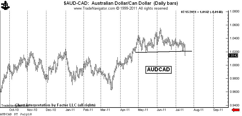
$AUDCAD — This forex pair completed a rounding top last week. I am short, but not as short as I would like to be. I will have orders in place to extend my leverage if the market can retest the top.
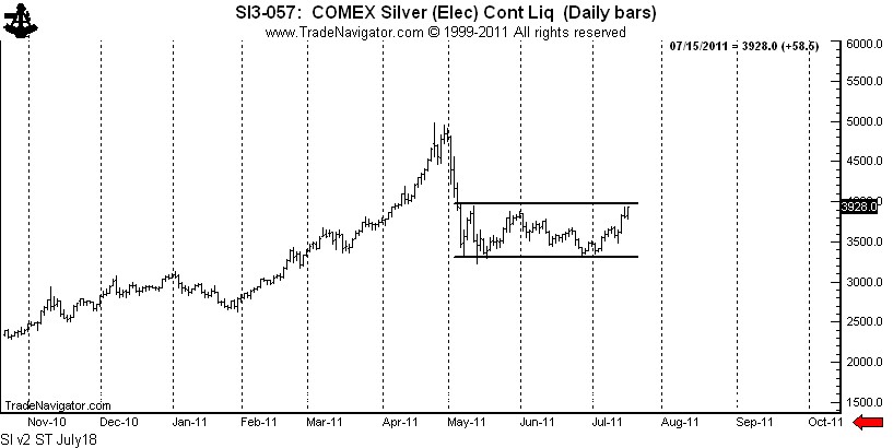
Silver: $SI_F, $SLV — The rally late last week completed a possible symmetrical triangle bottom. The bulls appear to be back in control in Silver. I do not have a position in Silver futures, but am long $SLV with a stop below last Wednesday’s low.
Was my forecast for $20 Silver wrong? Right now that is the way it seems. Trading is a marathon, not a sprint. I have some very bad news for all the Silver bulls who are such fond fans of my blog — I was NOT short last week. Sad, but true! I will let you know when I go short. By the way, I always trade with a stop and seldom risk more than 100 basis points per trading event (one percent of capital). 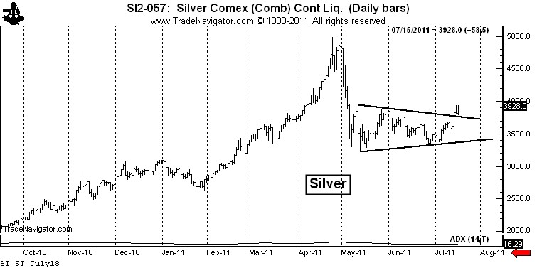
There is another intrepretation of the Silver chart that is not as immediately bullish. I have a great dislike for chart patterns with diagonal boundaries. The symmetrical triangle is my worst enemy. I much prefer a horizontal chart boundary. Silver has not yet completed a bottom if we use horizontal boundaries to define the trading range over the past 10-weeks, as seen below.
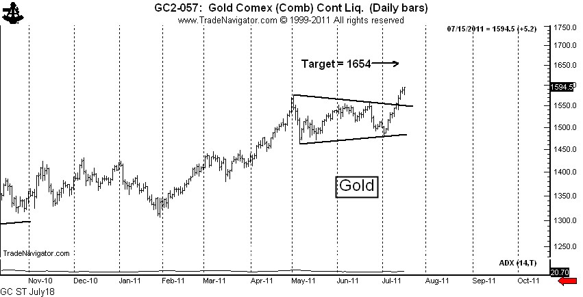
Gold: $GC_F, $GLD — The Gold market completed a text-book continuation symmetrical triangle this past week. I am long Gold futures and Gold ETFs. Gold, unlike Silver, may one day be monetized.
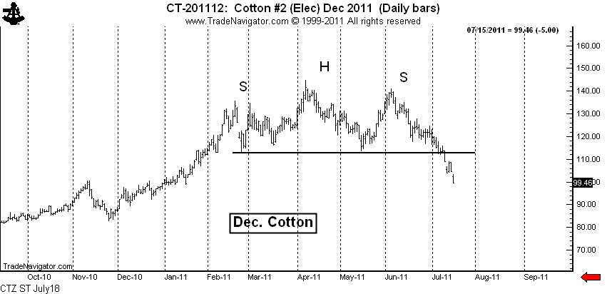
Cotton: $CT_F — I feel like an idiot. I shorted Cotton really well based on the H&S top. I felt like a genius when I covered on Friday, only to have the market go limit down. I really thought the market would cover the opening gap. I got cute — and I doubt the market will let me back in. Big profits are important. I let one get away in Cotton. I should have been adding, not covering.
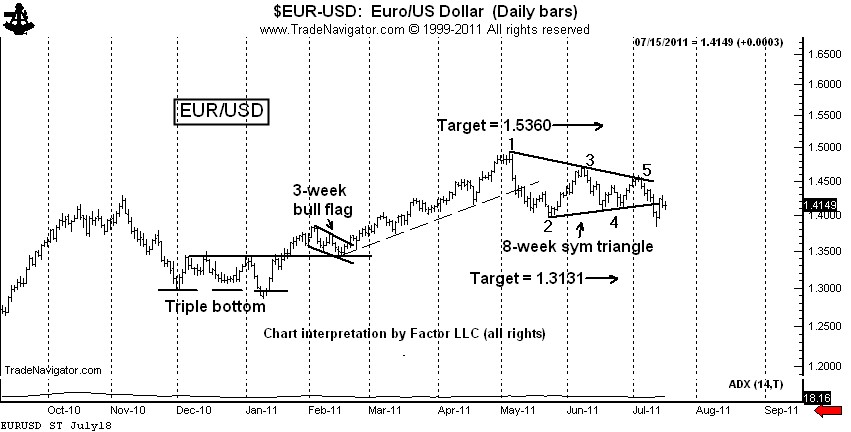
$EURUSD, $G6E_F, $UUP, $FXE — The decline on Wednesday completed a classic 6-point symmetrical triangle top. This completed triangle has been violated intraday, but not on a closing basis. I am short, using Thurday’s high as protection. I really thought I tagged a good one on Wednesday. The forex markets are vicious.
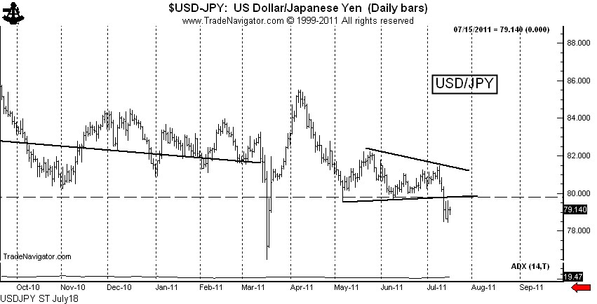
$USDJPY, $G6J_F, $FXY — The decline last week completed a triangle, but that is not the real story. Friday’s close is the lowest week-ending close in history, breaching the 1995 low (not shown). We may see Bank of Japan intervene next week, or it may be that the BofJ is capitulating until a lower price level is reached (such as 75.00). I am short $USDJPY and fully expect to have the BofJ run me out of the trade.
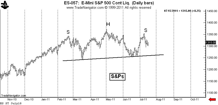
S&P 500: $SP_F, $ES_F, $SPY — This is my “pie-in-the-sky” chart. The daily graph displays a possible H&S top. If this analysis is correct (big IF), the right shoulder high is in place. This chart needs to be on everyone’s watch list. I am flat, tempted to go short under last week’s low. The CFTC Committment of Traders data released late last week was bearish.
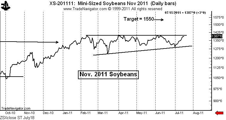
Soybeans: $ZS_F — This is an extremely intriguing chart. I fully expect that this chart pattern will be completed by an upside breakout — whether the breakout has follow through is a different story. I am lightly long Soybean futures with a stop below the July 12 low. I will add if the market breaks out intraday. I will add more if the market breaks out on a closing basis.
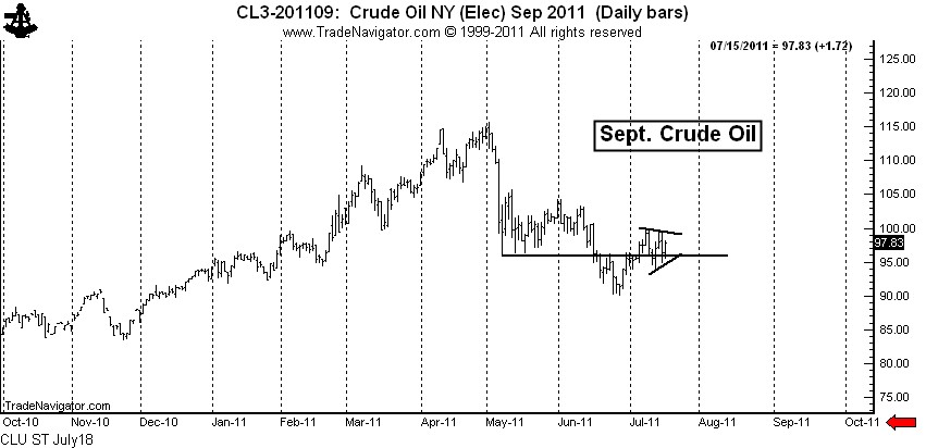
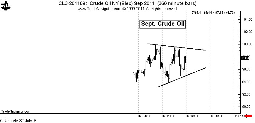
All the above charts are fairly long-term in duration. As a token to you shorter-term chartists, I leave you with Crude Oil. I am not in this market and probably will not become involved due to travel, but an interesting story can be told for getting long.
Crude Oil: $CL_F, $USO — If Crude Oil was in a “for-real” bear trend, then the May low should have turned back any and all rallies. Yet, the market has now climbed back above the May low. This is a sign that the May to June decline was a correction, not the start of a new bear trend.
On a shorter-term basis, the market is forming a 7+ day symmetrical triangle. A completion of this small pattern would probably lead to a test of the June 1 high at 104+. See the hourly chart below.
Let me throw in a couple of final charts. For the first time in a very long time I have some encouraging words for the millions of you who think Natural Gas prices are too cheap.
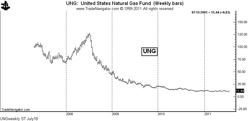
Natural Gas: $NG_F, $UNG, $UNL, $GAZ — Being long Nat. Gas ETFs has been a losing game due to the huge carrying charges that disappear each month. The weekly chart of UNG shows the result of this time decay.
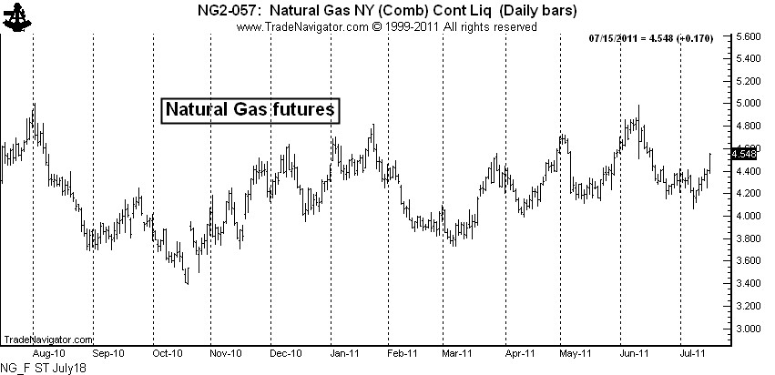
This time decay may continue to take place, but I can say with as much certainty as possible that the physical market has bottomed. The chart of Natural Gas futures shows that the market has lifted well off the 2010 low and is forming high lows and higher highs.
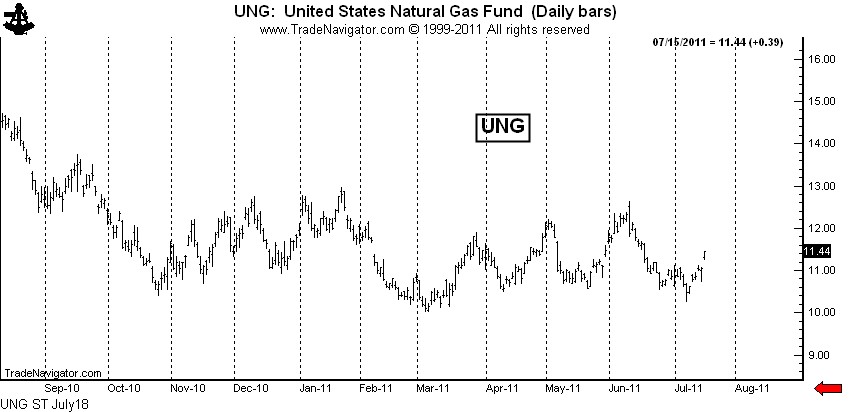
There is also some signs that UNG has bottomed — the March low may hold, despite the massive supply on hand and the negative publicity on fracking.
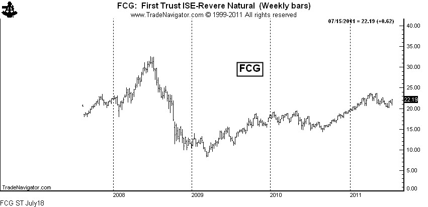
While there may come a time to be long the ETFs for the physical commodity, I would prefer to own the ETF for the producers and other companies deriving income from the production and processing of the product. A chart of FCG ends this post.
Markets: $AUDCAD, $SI_F, $SLV, $GC_F, $GLD, $IAU, $CT_F, $EURUSD, $FXE, $UUP, $ZS_F, $SP_F, $SPY, $CL_F, $USO, $USDJPY, $G6J_F, $UNG, $UNL, $GAZ, $FCG
###
Strong Opinions, Weakly Held!
/by Peter BrandtOn June 28, I posted a chart that overlaid Silver prices today with Silver prices in 1980 (see here). I saw the two periods as an example of analog price behavior. My conclusion was that — based on price behavior of the 1980s — Silver was headed to $20. At the time of the post I felt strongly about the market prediction.
Then on July 4 I added a post titled, “A potentially bullish development in Silver.” Based on the newly released CFTC Commitment of Traders data, I saw a new development in the Silver market.
Of course I got hit with some snide comments — “How could I be a $20 bear one day and start changing my mind just a week later?”
One of my favorite web posts of all time was by a trader I greatly admire, Barry Ritholtz, author of the blog The Big Picture. Barry is an astute market participant and observer. The post, from July 24, 2006, was titled “Strong Opinions, Weakly Held.” This blog, and the management philosophies it discussed, perfectly describe why I could hold strongly to a bear bias in Silver one week, and start to think differently just a week later.
Barry ended the post with the following sentence: “The bottom line is that strong opinions, weakly held is a mindset more investors need to familiarize themselves with.” I could not agree more.
Barry’s blog post was founded in the academic work of Professor Robert Sutton who teaches Management Science and Engineering at Stanford. Sutton’s work sought to distinquish between what was “smart” and what was “wisdom.”
As Ritholtz stated, “Being a successful investor often requires you to hold numerous conflicting concepts simultaneously — something many the average phyche has difficulty with. One must think through the best possible analysis for your positions, expend the time and effort to thoroughly test them. You need to be able to strongly argue your position — bullish, bearish or cash — but at the same time, be ready to admitt error and change views.”
When I express an opinion about a particular chart, it is most often a strongly held opinon. Keep in mind that for me a strong opinion does not necessarily equate to a trading position. Trading positions are brought about by a strong opinion PLUS a specific technical set up PLUS a favorable reward to risk relationship.
Strong Opinions, Weakly Held! What a great concept for a trader.
$$Study
###
The StockTwits stream…picking up nickels when there is a line handing out dollars
/by Peter BrandtYesterday’s drop in $EURUSD highlights the extremely short-term view of many traders in the StockTwits stream
This post is sure to step on some toes…but I have stepped on toes before and I will step on toes in the future. So here goes…
Let me emphasize that what I have to say in this post is not aimed at all participants in the StockTwits stream. There are many excelllent analysts, traders, risk managers and bloggers in the stream. You know who you are from your brokerage statements.
But, the StockTwits stream contains a significant amount of thinking and market manuevers that are — in my opinion — dangerously short term.
Yesterday morning I came into the office to find the $EURUSD down about 200 pips and experiencing the completion of a major bearish triangle. Not being a regular follower of fundamentals, I went to the stream to find out the reasons for the weakness. Within a matter of minutes, here are some of the stream posts I read:
- 1.4015 Long/ 30 stop
- freefall done for now, tempted to long here
- looking extremely cheap
- I believe him EURUSD
- 60min Buy in the dip!
- traders getting long
- Great bullish pattern on EURUSD, buy on the dip lol… long…
Frankly, I could not believe what I was reading. To make myself clear, I am not against a tradng system that includes a component for buying or selling a market based on a return to the mean from a price that is a certain number of standard deviations out of line. But, this was not the spirit of what I was reading.
Rather, I sensed way too many traders attempting to catch a falling knive because they missed the move down. And to me, this was an indication that the StockTwits stream has many market participants who make a habit of standing in line to pick up nickels when the next line over is handing out dollars.
If you consistenly make money catching knives, all the more power to you. I will never fault a person who has figured out a way to make a living from the markets. But, I strongly believe that such short-term trading is dangerous for many novice and aspiring traders for two reasons.
The first reason is that small miscues, misjudgements, execution snaffus and the like exponentially add up to become major hurdles to success as a trader’s time horizon shrinks. The second reason is that really significant trading profits come from the practice of holding positions and not by active trading. Additonally, the shorter term a trader becomes, the more he or she is competing with sophisticated HFT operations. And, whether a short-term trader uses market or limit orders, they need to know that they are buying at the offer and selling at the bid. HFT operations, in contrast, manipulate the computer trading environment in order to buy at the bids and sell at the offers.
So, if the shoe fits from what I have described, then wear it. If it does not fit, then ignore it. But if you have been standing in the nickel line and are unhappy with your overall trading results, I suggest you move over to the dollar line.
$STUDY
###
Oh, what a difference a chart makes!
/by Peter BrandtUsing slightly different charts of the same market produces different results.
Those of you who look at my charts on the blog or on Chart.ly might have noticed that I make wide use of nearby continuation charts in the futures markets. These are charts that plot only the nearest delivery contract. When one contract expires, the next contract month is then plotted on the same graph.
Even with the category of “nearby contract” charts there are differences. One approach is to plot the nearby contract until its expiration. Another approach is to follow the contract until first notice date. Yet a third approach is to drop the nearby contract when its volume shrinks below the next closest contract month. I use the third type most often.
Frequently the nearby continuation graph will give a different picture of a market than will the chart of a specific contract month. Take the current situation in Chicago Wheat.
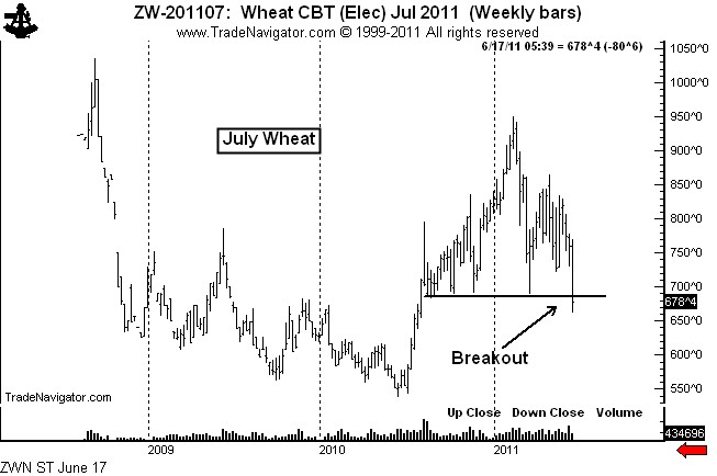
Shown below is the graph of the July Wheat contract. This chart shows that the 10+ month H&S top was completed on June 16.
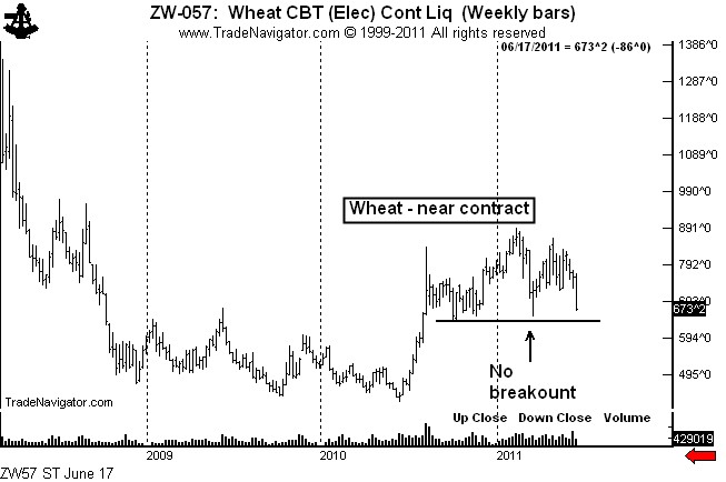
Yet, the H&S top on the nearby continuation chart has not yet been completed, as seen below.
I follow both types of charts — charts of the specific contract months and nearby continuation charts. It is by far my preference for the nearby chart to breakout first. I am always suspect of a market when a breakout by a specific contract month is not confirmed by the nearby chart. Many of my most profitable trades over the years have come from markets in which the nearby chart led the way.
###
Time to be short global commodity prices through ETFs
/by Peter BrandtA trade with a $10 to $1 reward/risk relationship
Major reversal patterns are predominant in all global commodity indexes. The ETFs offer a trading opportunity with a $10 to $1 reward/risk relationship. I will take these types of measured-risk trade set-ups all day long.
Background
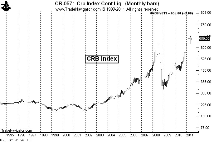
As shown by the long-term CRB Index, global commodity prices have been in an historic bull trend, with the Index advancing 107% from the late 2008 low and 269% from the 2001 low.
There is an old adage that, “Nothing cures high commodity prices like high commodity prices.” High commodity prices provide an incentive for manufacturers to find alternative and lower-cost production methods/components and for producers to bring new production on line.
There are some signs that commodity prices are overextended – and that significant price retracements are possible. In fact, H&S chart formations are appearing in all commodity-based ETFs.
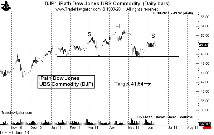
Below is the daily chart of the iPath Dow Jones-UBS Commodity ETF (symbol: $DJP). A decisive close below $47.00 would complete this top and establish an initial objective of $41.64.
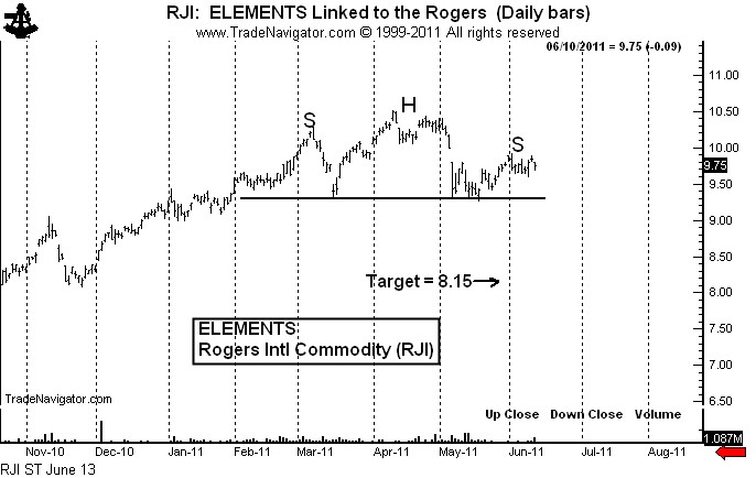
The ELEMENTS Linked to the Rogers Commodity Fund (symbol: $RJI) also exhibits a H&S top pattern. A decisive close below $9.20 would set a target of $8.15. Note on the charts of $DJP and $RJI the appearance of large down gaps on May 5. That these gaps have remained open is a sign of weakness.
Laying out a trade
I will attempt to establish a short campaign with a reward/risk relationship of about $10 to $1 using selected commodity index ETFs. Keep in mind that the sizing stated below is per each $100,000 of trading capital.
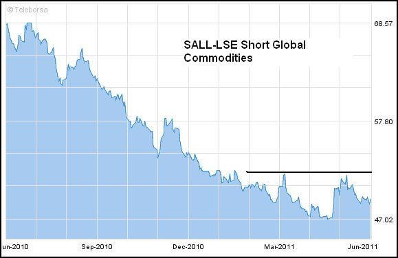
The London Stock Exchange trades a short commodity ETF, symbol $SALL (quoted in US$). I will buy 300 shares of SALL at $52.12 stop. My risk on the trade is $.80 per share, or a total of 24 basis points ($.80 per share times 300 shares equals $240). The target would be $57.80. If reached, my profit would be 170 basis points (or $1,704 per $100,000 of trading capital).
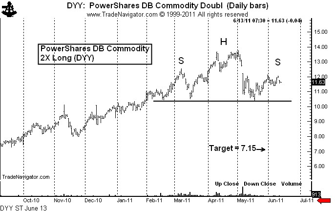
I will also short the Ultra 2X PowerShares DB Commodity Index ETF, symbol $DYY. I like the concept of being short the ultra-long ETFs because prices will erode if the underlying commodities drift sideways. Shorting an ultra-long ETF is similar to shorting an out-of-the-money call.
I have shorted the first layer of 200 shares today at $11.64 with a risk to $12.75 (22 basis points). I will short the second layer of 200 shares below the existing June low at $11.24 stop. If filled, I will risk the first layer to $12.22 (12 BP) and the second layer to $11.81 (11 BP). So, after two layers are established my total risk on $DYY will be 23 BP, or $230 per $100,000 of trading capital.
I will short a third layer of 200 shares of $DYY at $10.14 stop, and if filled I will risk my entire position to $11.06. This would lock in a profit of 11 BP in layer one and 3 BP in layer two. The risk on layer three would be 18 BP. The composite risk on all three layers of $DYY at the point of entry of layer three would be 4 BP.
The target of $DYY would be $7.15. If all goes according to the plan (and this seldom ever happens), my profit on the three layers combined would be 231 BP ($2,310 per $100,000 of capital).
I would anticipate that $SALL would be filled on the same day (+/- one day) as the third layer of $DYY. If all goes according to the plan, my maximum risk will be about 30 BP, or 3/10th of 1% of capital, and my profit potential is about 400 BP (or 4% of capital). Thus, my reward/risk relationship is at worst $10 to $1.
NOTE: If commodity prices rally from present levels and the symmetry of the H&S patterns is disrupted, then all aspects of this analysis and trading strategy will be nulified.
###
Recent Posts:
 Massive bull move coming in grain markets?April 27, 2026 - 6:11 pm
 Factor Weekly Update, March 21, 2026 – Sample Weekly ReportMarch 24, 2026 - 3:44 pm
 The January Effect 2026 EditionMarch 10, 2026 - 3:22 pm
 Free ChartWizards ReportJanuary 5, 2026 - 1:17 pm

