Turning a chart on its head

Sometimes a possible top gains clarity if one can flip the chart over and view it as a possible bottom. The easiest way to do this is to print a chart and flip it 180 degrees. But since I cannot do this with a blog post, I did the next best thing — convert a chart into its reciprocal value. Those of you familiar with spot forex know exactly what this means and how to do it. Forex trades can trade many currency pairs in the reciprocal.

The possible top I am referring to is in Soybean Oil. First, let us look at the chart straight away.

My initial response to this chart is that a contiuation congestion is occurring and that a breakout into new highs would lead to another strong advance.

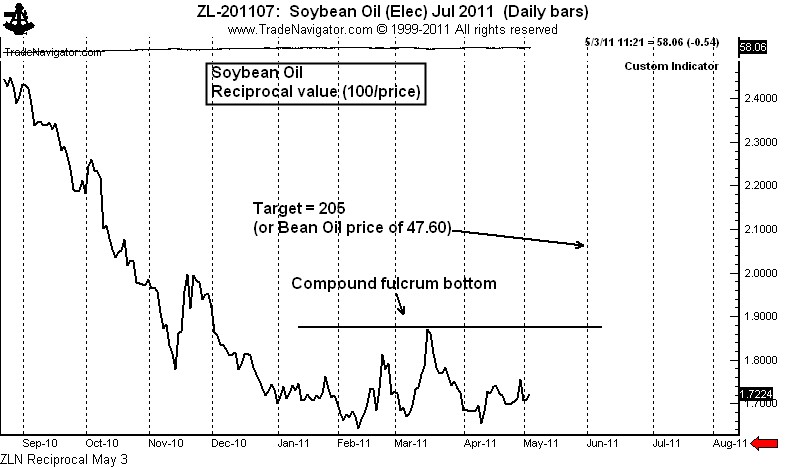
But when I “flip” the chart, my initial reaction is different. Shown below is the reciprocal value chart of July Soybean Oil. What can be seen very clearly is a possible bottom pattern known to point and figure chartists as the “compound fulcrum.” The compound fulcrum is a bottom pattern about 80% of the time, a top pattern the other 20%, and is a powerful chart formation.

A compound fulcrum bottom can best be described as a H&S top pattern that serves as a bottom. Keep in mind that a bottom in the reciprocal chart equals a top in the actual commodity.

This pattern in the July Soybean Oil would have a target of 205 which is equivalent to 47.60 in the price of July Bean Oil (compared to a current price of 58.00). There are two problems with this trade. First, more price action is needed to develop symmetry in the pattern — another two to three weeks of sideways movement followed up a gradual uptrend in the reciprocal chart would do the trick.

The second problem is fundamental in nature. Soybeans are VERY cheap compared to Corn, and Soybean Oil is likely to remain strong compared to Meal, because Meal is now competing in the feed market with the residual mash from the Corn ethanol process. While these factors do not seemingly bode well for a bear trend in Bean Oil, conventional wisdom is often wrong. Some of my best trades over the years have been trades flying in the face of conventional wisdom. The public is a major long in grains. The public is subject to shake outs.

The Soybean Meal chart is also potentially bearish. The August contract daily chart displays a possible top in place followed by a H&S pattern.

If these patterns develop more fully they would set up as trades for me. Remember, I am looking for patterns that will stand the test of historical scrutiny as among the best 10 to 20 classical patterns of the year. I think both of these charts are candidates. But the price action has not yet confirmed the signals.

###

Silver is a way to play the US$ — NOT!!!!!

If you are bearish on the US$, there are better bets to make.

In recent days many a Silver bull has attempted to convince me that Silver is a play against the US$. I don’t buy it for a minute. Silver is a raw material commodity. End of story. That Silver is considered a semi-precious metal is irrelevant.

In fact, I will maintain that there are far better ways to make a bet against the US$ than by owning Silver. A picture is worth a thousand words. So I will let the graph below do most of the talking for me.

From the price lows of the 1980s/1990s, Silver has increased 13.2 fold against the US$. In contrast, Gold has only increased by a factor of 6.0 – in other words, Silver has been twice as good of a bet. On a pure price appreciation basis, Sugar was a better hedge against the US$ than was Gold. Perhaps we should all be carrying Sugar cubes to protect us against the incompetence of the Geithner/Bernanke cabal.

So what has been the best bet in US$-denominated terms – stocks – all stocks. In fact, the DJIA has outperformed shares in the largest precious metal producers, BHP Billiton and Freeport-McMoran (both of which have outperformed Silver). In fact, the DJIA has outperformed Silver by 33 percent, even after one of the worst performing decades for stocks in history. This does not even factor in dividends – and the last time I checked, the only dividend Silver pays is oxidization stains in the pocket.

If you want to make a play against the US$, Silver is a second-class citizen with the last name of “Bubble.”

This bull market may carry Silver prices to $60 or $70 or — as proof of the market’s absolute insanity — even $100. But I stand by my prediction that within five years Silver prices will be in the teens.

###

Using hourly charts to trade silver

Even a market blow-off has a Silver lining

As a general rule I do not like using intraday charts. The reason is that intraday chart patterns have a failure rate of 75 percent, although I know some excellent short-term traders who use intraday charts in conjunction with various indicators to wring a profit out of the markets consistently. But as for me, intraday charts are normally not in tool box. Normally, that is!

There are rare market conditions during which intraday charts can be extremely useful for scalping and timing. The predominant condition is when a market is in a sharp advance or decline. In such market conditions, intraday charts can be useful for identifying the end of a countertrend correction or brief consolidation. Hourly charts are utterly useless, in my opinion, in broad sideways markets such as we currently have in Copper, Soybeans, USDJPY, to name a few. But for running markets, intraday charts can be a great tool.

Thus was the case this week in Silver. I absolutely believe that Silver is in the blow-off stage of a massive bubble. I have heard all your arguments for why Silver is fairly or even cheaply priced at these levels – Fed policy, weak dollar, etc., etc. Frankly, I don’t buy these reasons. This time it ISN’T different. I heard similar arguments from perpetual Silver bulls for 25 years after the last Silver bubble burst in 1980. According to the Silver bulls then, they were right and the market was wrong. They point to the current bull market as their redemption. Some redemption! Anyone who bought Silver at the absolute low in 1982 has earned a compounded 8.1 percent annually at current price levels. But even this “spectacular” rate-of-return has to be downwardly adjusted for the cost of carry.

Anyway, back to the hourly chart theme. 

Sunday evening I posted a blog stating my opinion that Silver was in a bubble. To traders, having an opinion is different than having a position. Opinions are NOT positions. Early on Wednesday, using Chart.ly, I began posting hourly charts suggesting that Silver was preparing for another (and final?) upleg in the blow off. The intraday charts were clearly showing that a corrective phase in Silver was coming to an end. Following are these Chart.ly posts. 

“Think SI is in blow-off, but one more big leg poss. Watch rect on hrly chart for timing.” Apr27 6:32AM.


 “Resolution of hrly chart will either lead to another up leg or confirm a possible top.” Apr27 12:50PM


The, finally…”Hrly rectangle completed. Should usher in new up leg.” Apr27 1:59PM 

So the lesson is this – in sideways and choppy markets, except for the swift of foot, intraday charts are not very useful; but, in running markets intraday classical chart patterns can be used for low risk scalping. By the way, the target of 47.84 from the rectangle bottom on the hourly chart has almost been reached as of this writing. And notice that a new rectangle is appearing on the hourly chart.

By the way, there is another lesson in this story. Taking positions against one’s bias is not only possible, but can often be quite profitable. To a trader, an opinion is not a position and a position is not an opinion.

It will probably be another year before I blog about hourly charts.

###

Has chart trading become unreliable?

Charts don’t work like they used to!

This is the first of three blog postings on the (un)reliability of chart patterns for trading. This posting lays the claim that chart patterns are increasingly unreliable for trading. The second posting (when I get to it) will pose the possible reasons why this has occurred. The third posting will address solutions to the problem.

I’ve traded futures and forex on the sole basis of classical chart formations since 1980. I have not used volume or open interest, Commitment of Traders data, moving averages, oscillators, or any of the “latest and greatest” technical indicators. In fact, I am not a fan of indicators because they are simply derivatives of price. My attitude has been, “Why study derivatives of price when I can study and must trade price itself?” If you disagree with me and have been consistently successful, your success speaks for itself. In the business of trading, everyone must find their own niche that works.

If anybody has earned the right to speak about chart patterns, I think I should at least be on the short list. My conclusion – chart patterns are far, far, far more unreliable today than at any other time in my trading history.

There was a time (in the 1980s – many of you were not even born then) when as a chartist I would enter a trade based on a classical chart pattern and mentally and emotionally “bank” the profits. Patterns were extremely reliable. But, when patterns did not work, at least traders on the other side of the market made money! If I am long and wrong, I want traders who are short to make money. That is the way it should work. The worst possible trading environment, in my opinion, is when both long and short position traders are eating humble pie.

There is one other dimension to this. In the “good olde days,” when a chart pattern failed it told me something important about the market. Now, patterns just fail and provide no lessons. I have never been a very good “range” trader.

My guess (I wish I had kept good data back then) is that 50-plus percent of chart patterns worked in the 1980s. I define “working” as reaching the measured-move target without digging back into the completed pattern. Usually patterns worked immediately and decisively.

In recent years only 25 percent of patterns have worked. We have entered a period I call “chart morphing.” This may represent the new norm. Chart morphing occurs when one identified chart pattern breaks out, but fails, only to become a component of a larger chart pattern, that in turn breaks out, but fails, only to become a component of a larger chart pattern, etc., etc.

The following chart of Sugar demonstrates this chart morphing concept. In this case I identified and traded six patterns in real time. Only one delivered a profit. There was a time when three or four of six patterns, not one of six, would have delivered a trend to the implied target. We now have a six-month trading range in Sugar with no clue as to the next dominant chart pattern. As a chartist you may have labeled May Sugar in an entirely different way. That’s what makes a market.


The above reality of chart morphing is that a trader can lose 80 points in a 30-point trading range over a sequence of trades and months only to become gun shy just in time for the real breakout to occur. If you are a chart trader, is this a world you can relate to? 

Does all this mean that classical charting is no longer a valid way to trade? Not at all! It does mean that the time frames, tactics and money management principles of using charts must be modified. I will have more to say about these things in future posts.

###

Up, Up and Away — U.S. Stock Market

This content is for members only

I’ve never liked the taste of Humble Pie!

AKA, when I short AAPL pie, I need to prepare to eat HMBL pie

A number of readers have asked me to recap my recent trades in Apple Computer. Of course, I was a busy little beaver posting the details of my shorting campaign – mainly motivated by all the hate messages I received from my initial AAPL posting, then the post that laid out a trading strategy to risk 75 basis points (3/4 of 1%) to make 1420 basis points (14.2%).

I detailed my trading in AAPL during the course of six blog posts and 15 StockTwit posts. See the chart for the graphic representation of my trading. The sales are circled.

So, here is how my AAPL trade unfolded.

  • Sold 100 shares on 4/8 at 338
  • Sold 100 shares on 4/8 at 334.90
  • Bot 100 shares on 4/12 at 332.02
  • Sold 100 shares on 4/14 at 332.41
  • Sold 100 shares on 4/18 at 322.87
  • Bot 100 shares on 4/18 at 328.34
  • Bot 100 shares on 4/18 at 331.81
  • Bot 100 shares on 4/18 at 331.82

Bottom line:

  1. I planned and executed a short play in AAPL
  2. AAPL ended up springing a gigantic bear trap
  3. I ended up shorting and covering 400 shares per $100,000 of capital
  4. My net gain was 42 basis points (4/10th of 1%)
  5. The bulls won out in the end (or so it seems as of today)

Lessons:

  • The AAPL lovers appear to be right after all – congrats. A trader needs to be a good loser to be a good winner
  • Trading is all about risk and trade management
  • Without hesitation, I would do the short campaign all over again in any other market that displayed the same chart construction

###

The Apple has fallen (AAPL Part 6): 04.18.2011

The Apple has fallen…look out below!

The decline by Apple today has completed a major reversal head and shoulders pattern. In the process I have now sold the final 1/3 (another 100 shares per $100,000 of capital) of my short campaign.

A close above today’s high at 328.14 and especially above the Apr. 13 high at 336.14 are required to negate the bearish interpretation of this daily chart. A close below 322 would confirm the top and establish an objective of 280. Retests of the neckline at 325 to 326 are probable, but the neckline should offer significant resistance.

As detailed by earlier blog postings and communications on StockTwits, my position is now short 300 shares per $100,000 of capital (100 at 338, 100 at 332.41 and 100 at 322.88). I am risking 100 shares to 328.32 and 200 shares to 333.41. So, my risk on the entire short position is 20 to 25 basis points. My potential gain is 1500+ basis points. This trade now has a reward/risk ratio in excess of 70 to 1.

###

Apple Computer, Part 5: 04.15.2011

Is a weak Friday close a sign of weak earnings?

Next week is earnings week for AAPL. The weak close expected today could be a “tell.” The H&S continues to form. I am short two layers of AAPL, waiting to place the final layer at the completion of the top. The rally on Wednesday sets an excellent opportunity to lower stops on my entire current position to 336.31. This locks in a net profit for the short position of 200 shares per $100,000.

At this point I have zero risk on the trade unless the earnings report results in a strong up gap. This H&S top is classic in form, symmetry, volume profile, and behavior. The symmetry of the pattern projects a pattern completion for early next week. However, right shoulders can become extended.

It is important to remember that a top has not yet been confirmed. A close below 322 is needed to firmly set an objective of 280 to 285.

###

Special Report, Buy Soybeans & Sell Corn: 04.13.2011

This content is for members only

Appless Computer – Part 4: 04.12.2011

Apple is declining into support.

The poisonous wrath from the Apple Computer “fruit and nut club” continue to come my way. Here are just a couple of excerpts from the “fan” mail I have received because I suggested that AAPL might be topping out.

  • “This is nonsense. Never heard of a double head. This is a bullish flag, which means the upside will be equal to its previous rising leg. STOP giving false forecast.” (Emphasis not mine.)
  • “Charting[is] so 90…Hello High Freq Trading.”

I do not find these comments offensive or even irritating. I only bring them up because of the humor involved.

“Never heard of a double head.” OK, start with Edwards and Magee, 5th edition, pages 68, 69 and 76 for starters. A double head is not my invention.

“Charting [is] so 90s.” Well, with this in mind let me comment on the chart of AAPL.

The decline on Monday (the 10th down day in 11 days — not exactly a show of strength) has brought prices closer to the critical neckline of the 3-month H&S top. It is show time! The market is NOT oversold, yet I must emphasize that AAPL has NOT completed a top and until it does the trend must be viewed as being UP, not down. The neckline at around 224.50 (+/- 2) will be a magnet for prices.

A decisive close below 320.50 will be the kiss of death for AAPL, and will set up a target of 280 to 285. But if the market can hold above 320, turn back up, spend a full day above the neckline and then advance over 342, a major chart buy signal will set up. Until then I assume that the H&S top will become a reality.

I am short. I have moved stops to 335.81 and 340.27. My risk is presently about 38 basis points. I plan to cover some shorts today if the market opens lower and holds. I would then put the shorts back on if a rally develops. But, if the market opens lower and cannot fill the subsequent gap in the days ahead, my advice to Isaac Newton is… “Duck!”

BTW, there is an upside gap on the chart at 323.48 from Dec. 31. The market may be attempting to fill this gap. Or, the market may gap below the neckline and form an “area island top”….which, of course, like the double head, is also a chart formation I am just making up.

###